
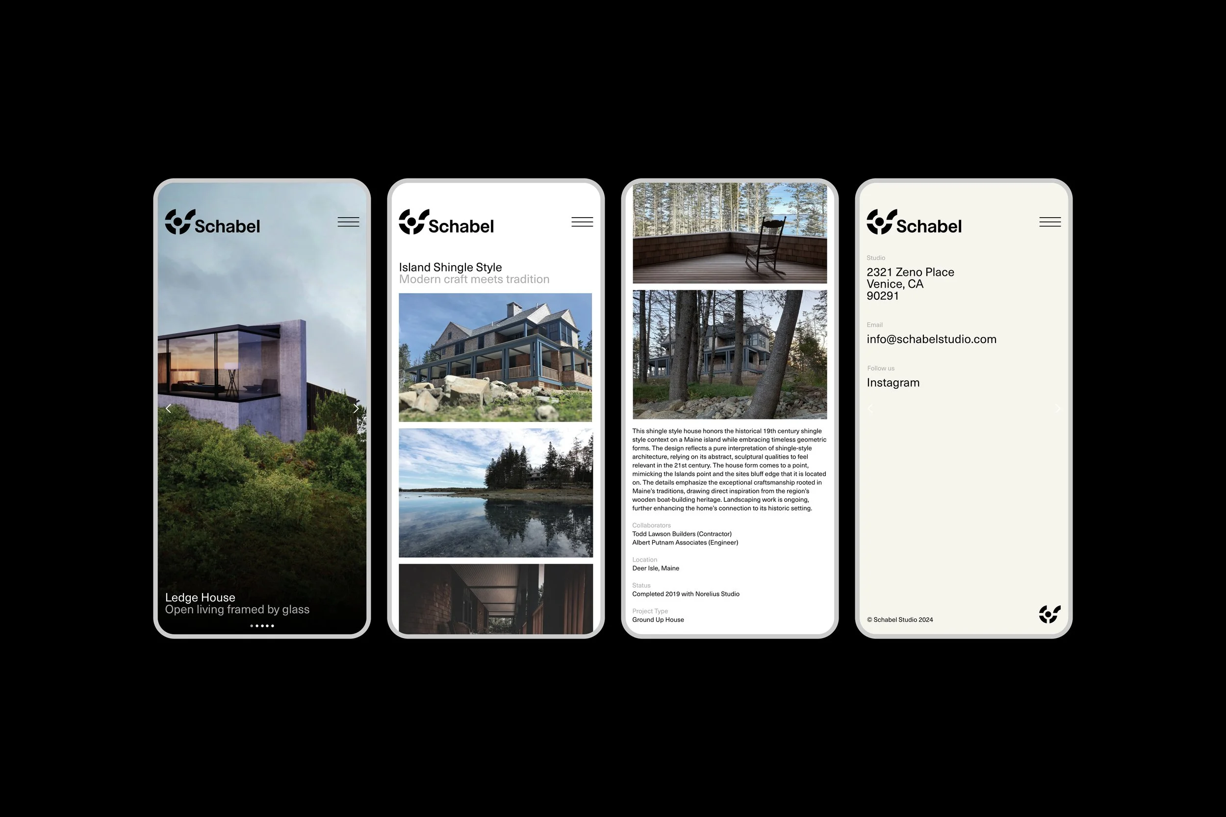
Schabel is a Los Angeles architectural studio specializing in custom residential design. The homes they craft are beautiful, functional, and thoughtfully aligned with how their clients want to live. At their core, they are partners in bringing unique visions to life.
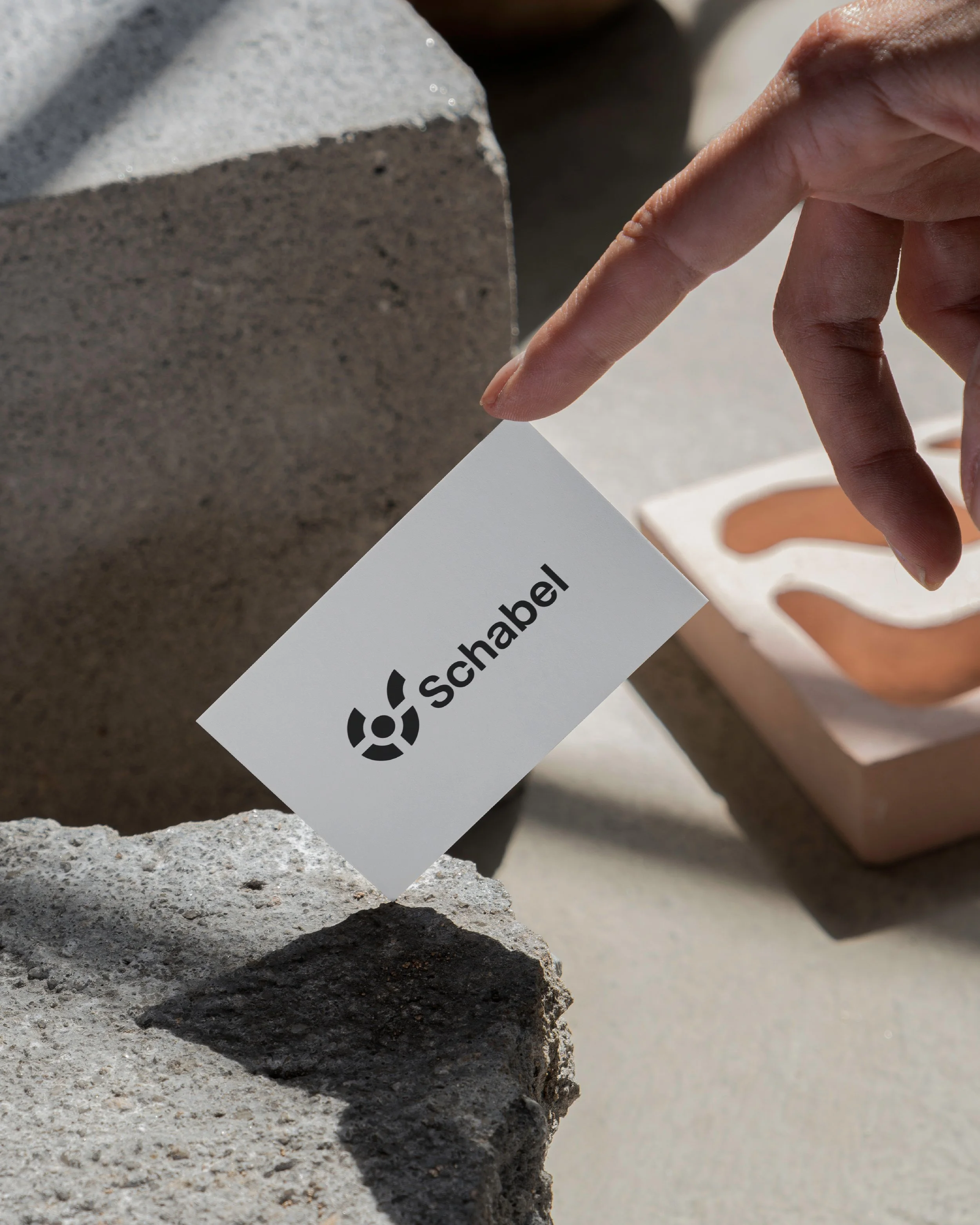
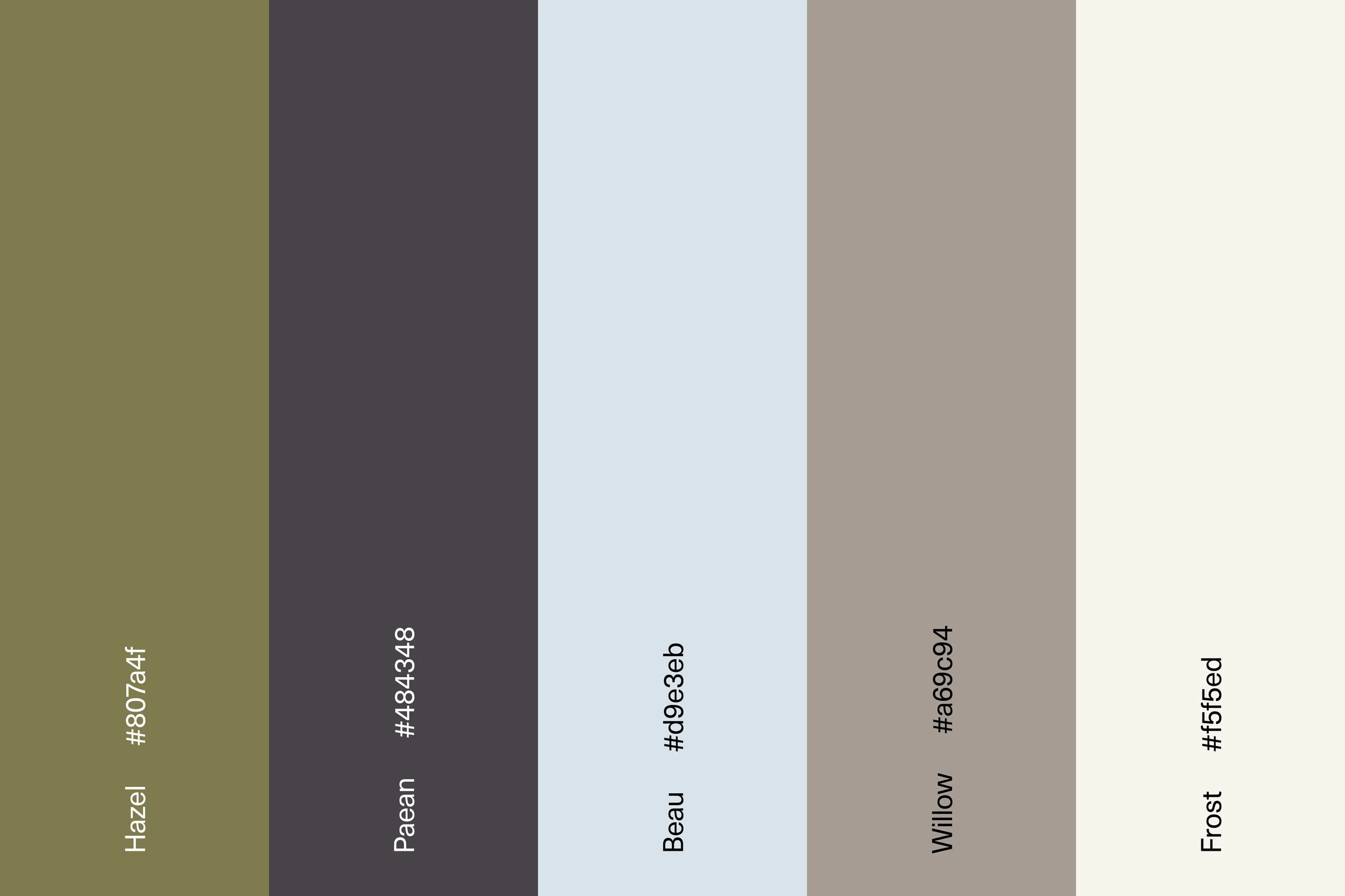
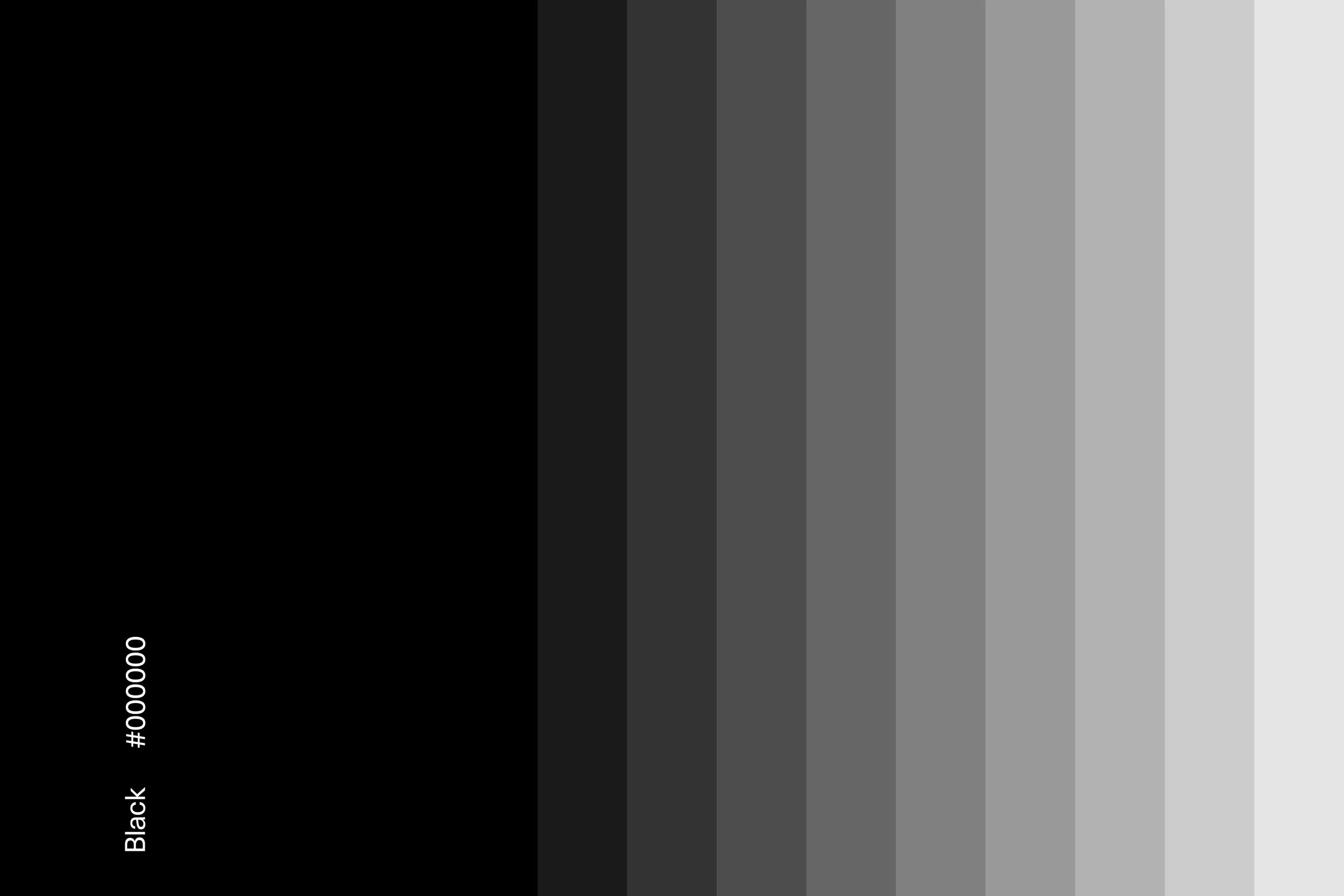
As Schabel’s vision grew, the firm’s identity was reimagined to better connect with its intended audience. We started by redrawing the symbol. The original while bold, lacked visual ease. The updated mark introduces a more harmonious rhythm, replacing the impression of construction with one of craft. This subtle curvature refinement carries into the rounded detailing in the wordmark. It is geometric and meticulously balanced. We developed a color palette that is quietly sophisticated, where each pairing introduces subtle tension and harmony. Neue Haas Unica Pro is a versatile typeface that anchors this minimal brand identity.

“Working with Denzil on developing the identity and website for my LA–based architecture firm has been an incredible experience. From the start, he understood my vision and translated it into a clean, sophisticated brand that truly reflects our ethos. His keen design eye, combined with his ability to collaborate, made the process smooth and efficient. He has been extremely responsive, and always brought thoughtful, creative solutions to the table. I couldn’t be happier with the results and highly recommend him to anyone looking for top-tier design services.”
Craig Schabel
Principal Architect, AIA




Collaborators
Brand Positioning — Letterform
Words — Letterform
Platform — Squarespace
Client
Schabel Studio
Industry
Architecture
Location
Los Angeles, CA USA
Services
Strategy, Identity, Digital, Print
Year
2024–ongoing
You may also like

HELEO
Challenge the status quo
Olten
Quality living experiences

© SUPAMONO