
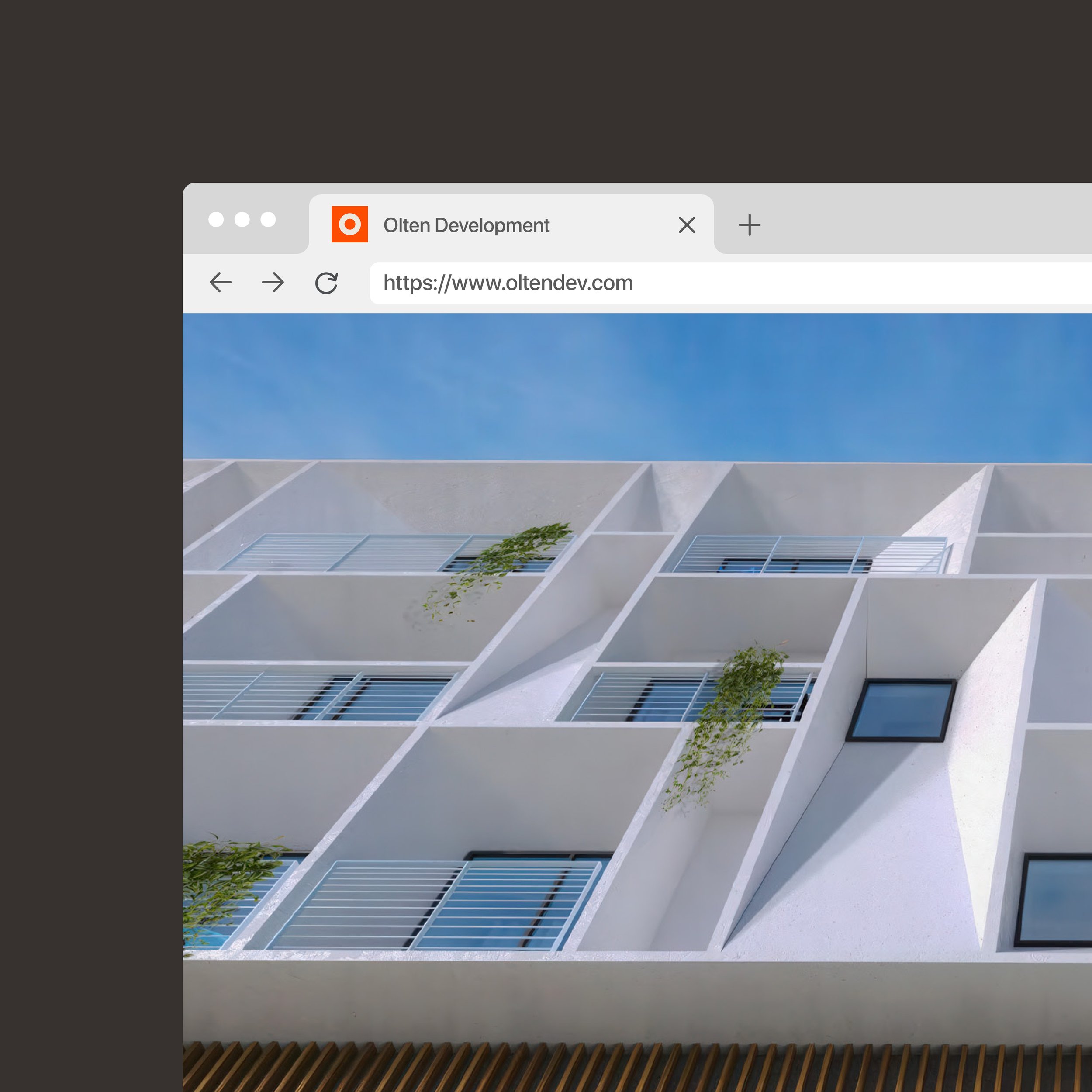
Olten Development is a full-service real estate developer based in Los Angeles. Their mission is to create sustainable, high-quality homes that strengthen communities, create opportunity, and safeguard long-term value for their partners.
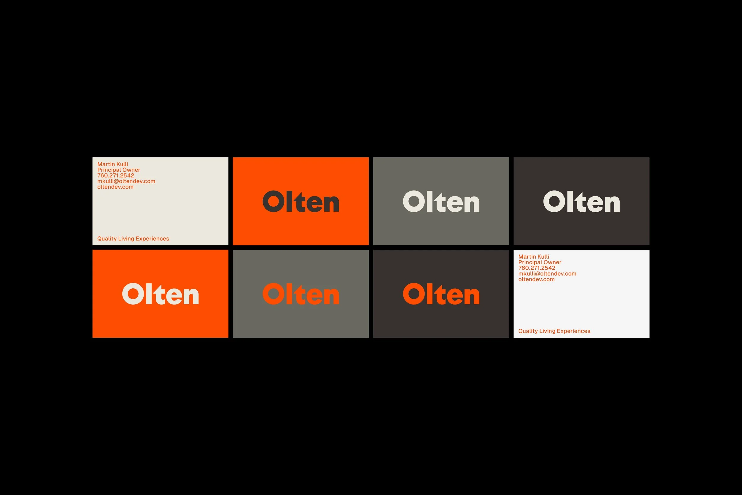
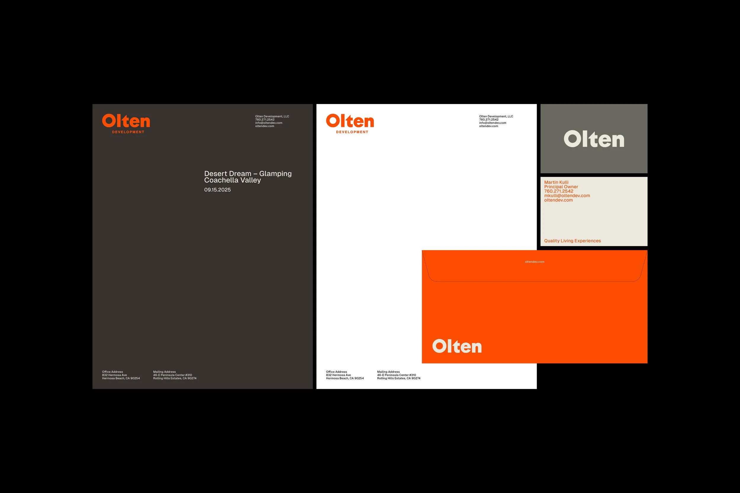
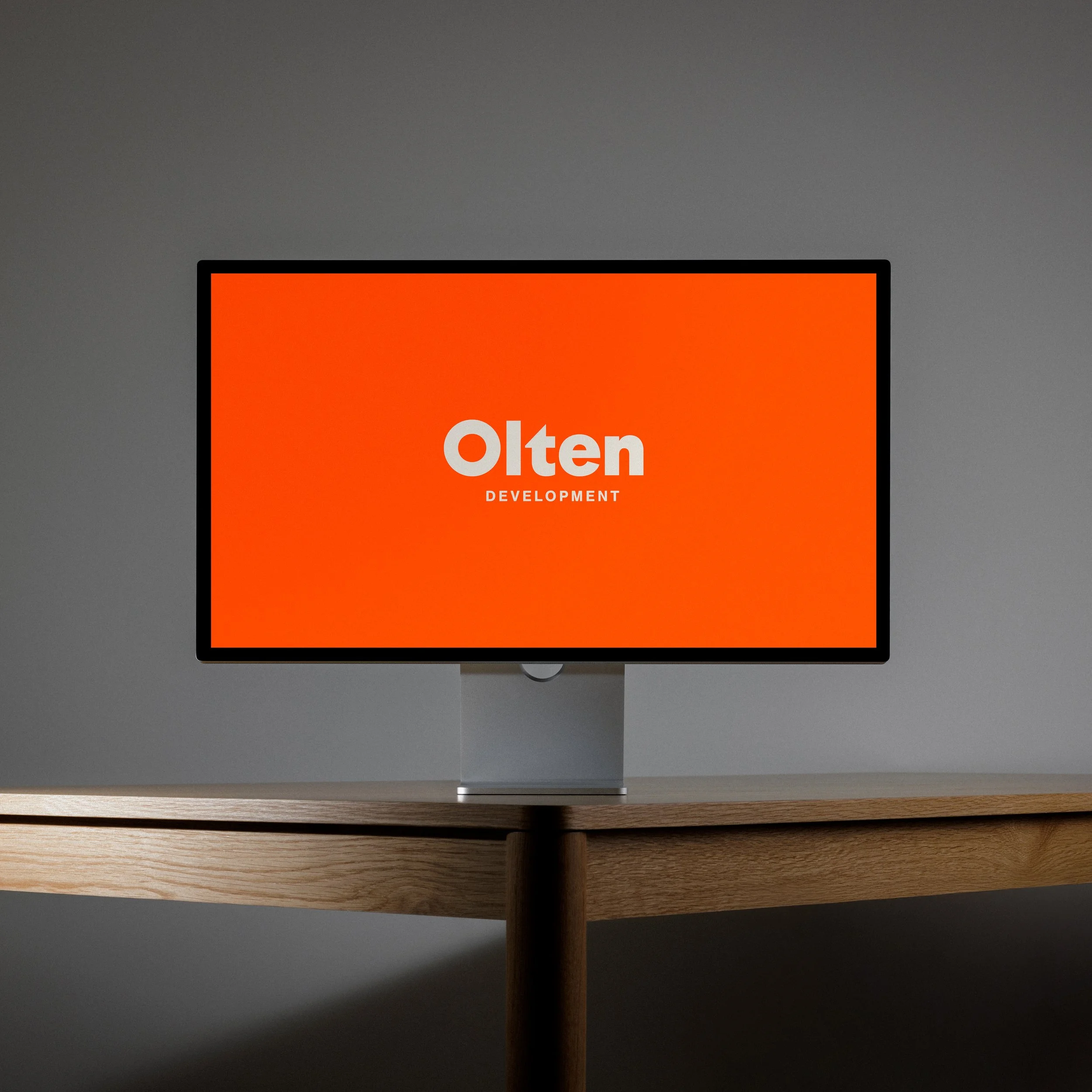
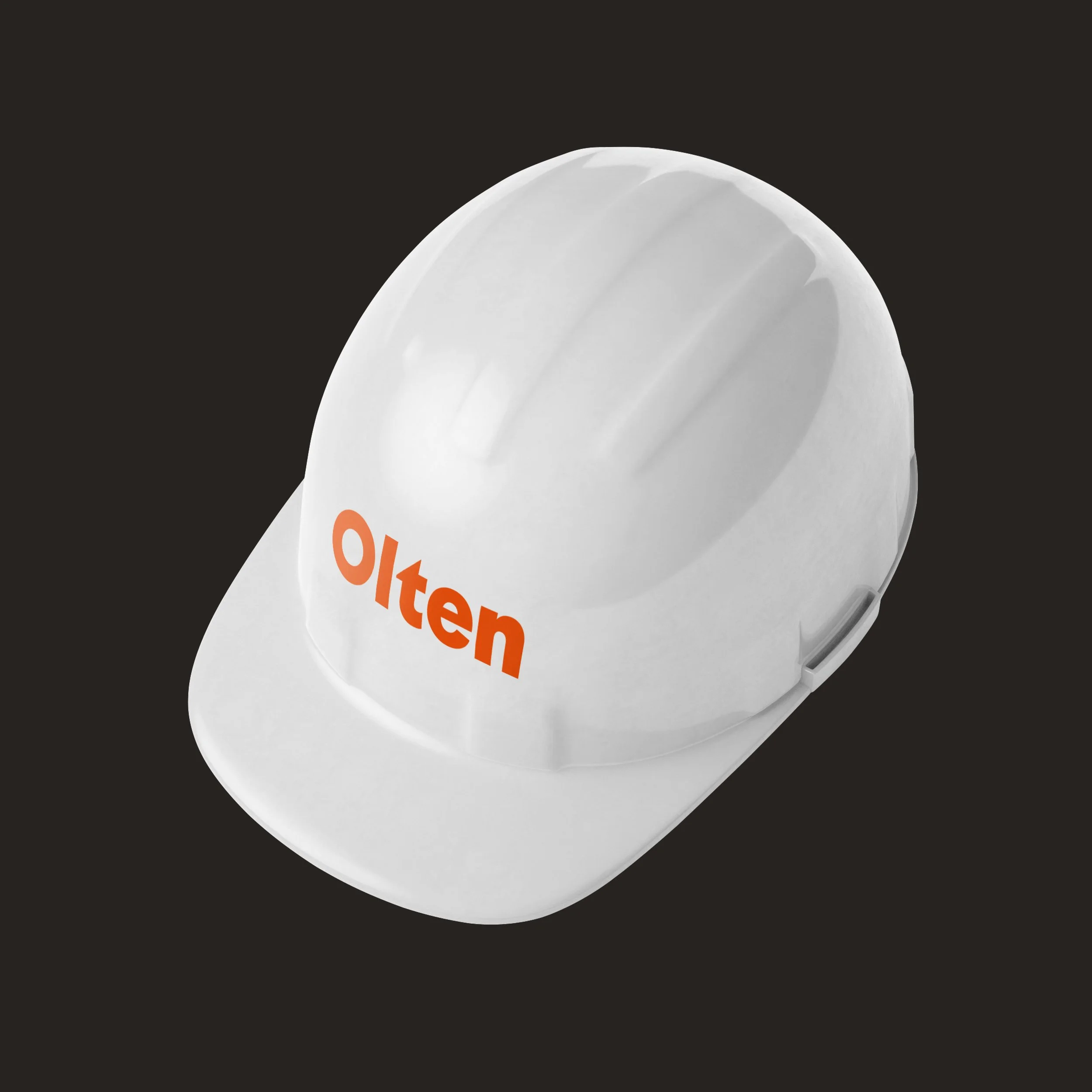
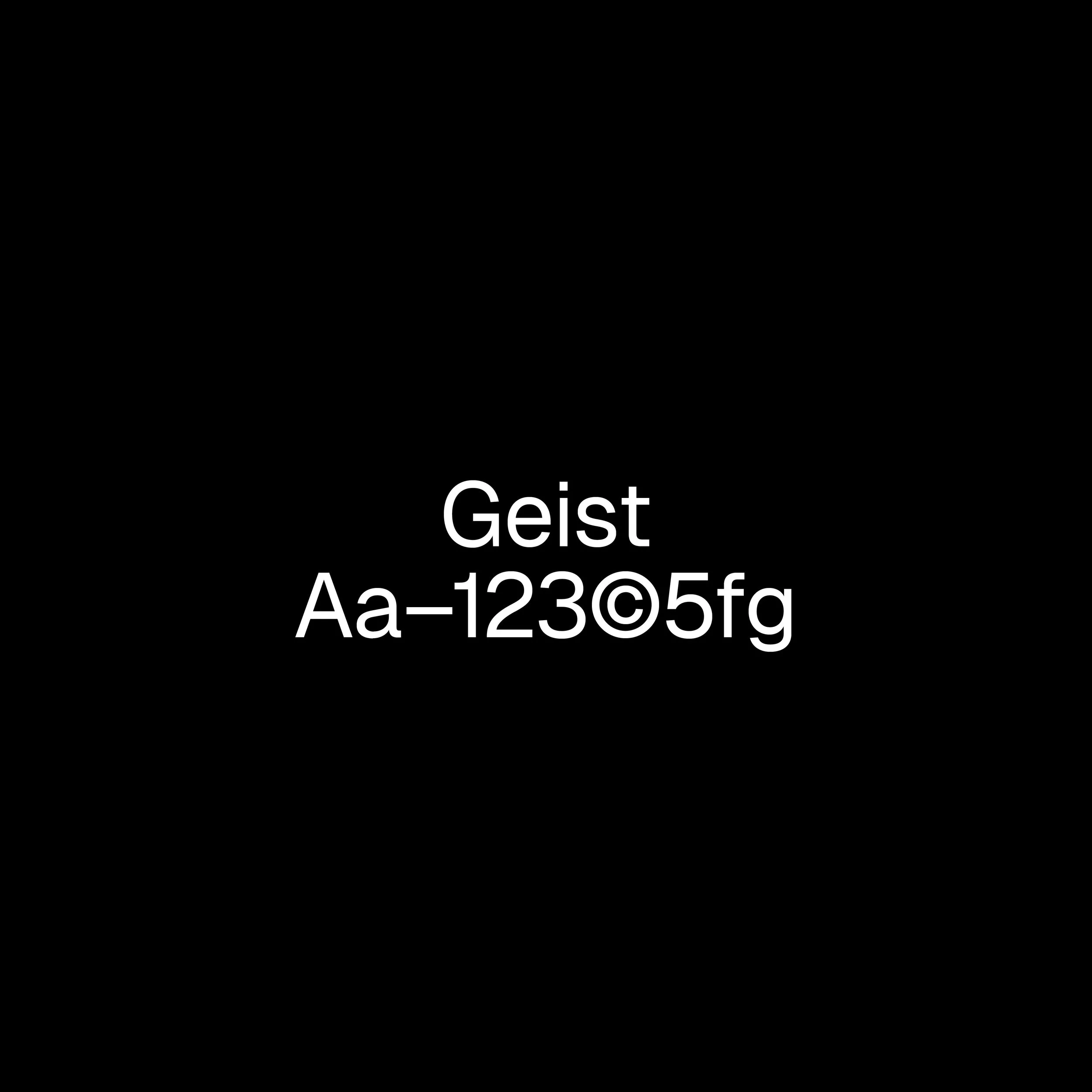
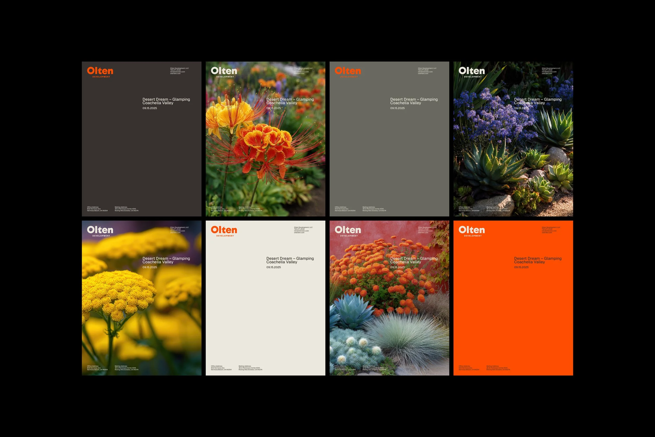
Color played a defining role in establishing presence, from a vivid orange that signals energy and optimism to supporting tones echoing materials found in architectural environments. The logotype is bold and geometrically precise, designed to retain legibility across every scale. The Geist typeface brings a human counterpoint, reflecting Olten’s commitment to livable design. Vivid botanical studies ground the system, creating a dialogue between the built and the natural. Together, these elements position Olten as a developer that builds not only structures, but stories.

“Denzil made the branding and website process seamless—fast, creative, and always responsive. He took the time to understand our vision and delivered a brand and site that not only look great but finally feel true to who we are.”
Martin Kulli
Principal Owner


Collaborators
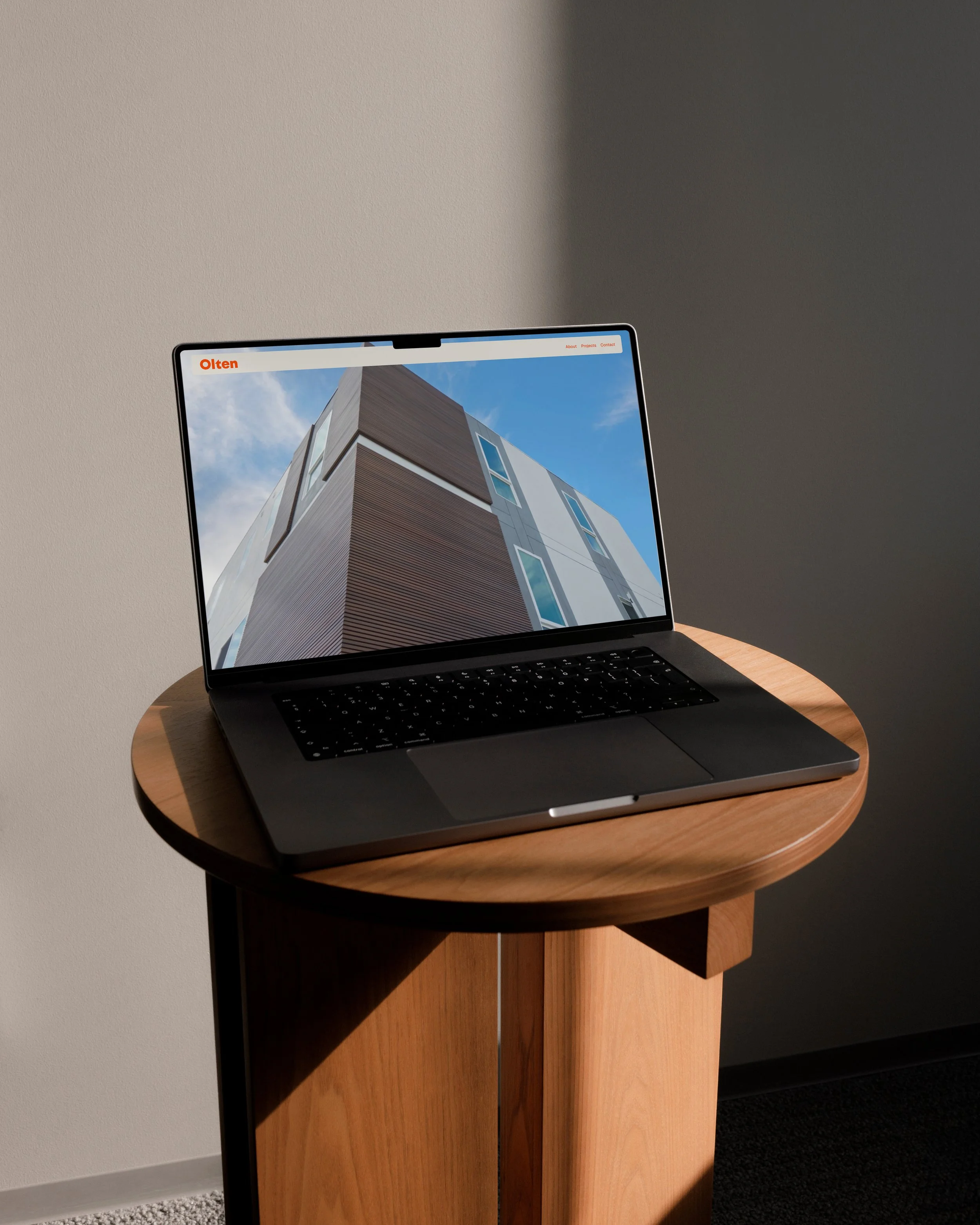
Platform — Squarespace
Client
Olten Development
Industry
Real Estate
Location
Los Angeles, CA USA
Services
Strategy, Identity, Digital, Print
Year
2025
You may also like
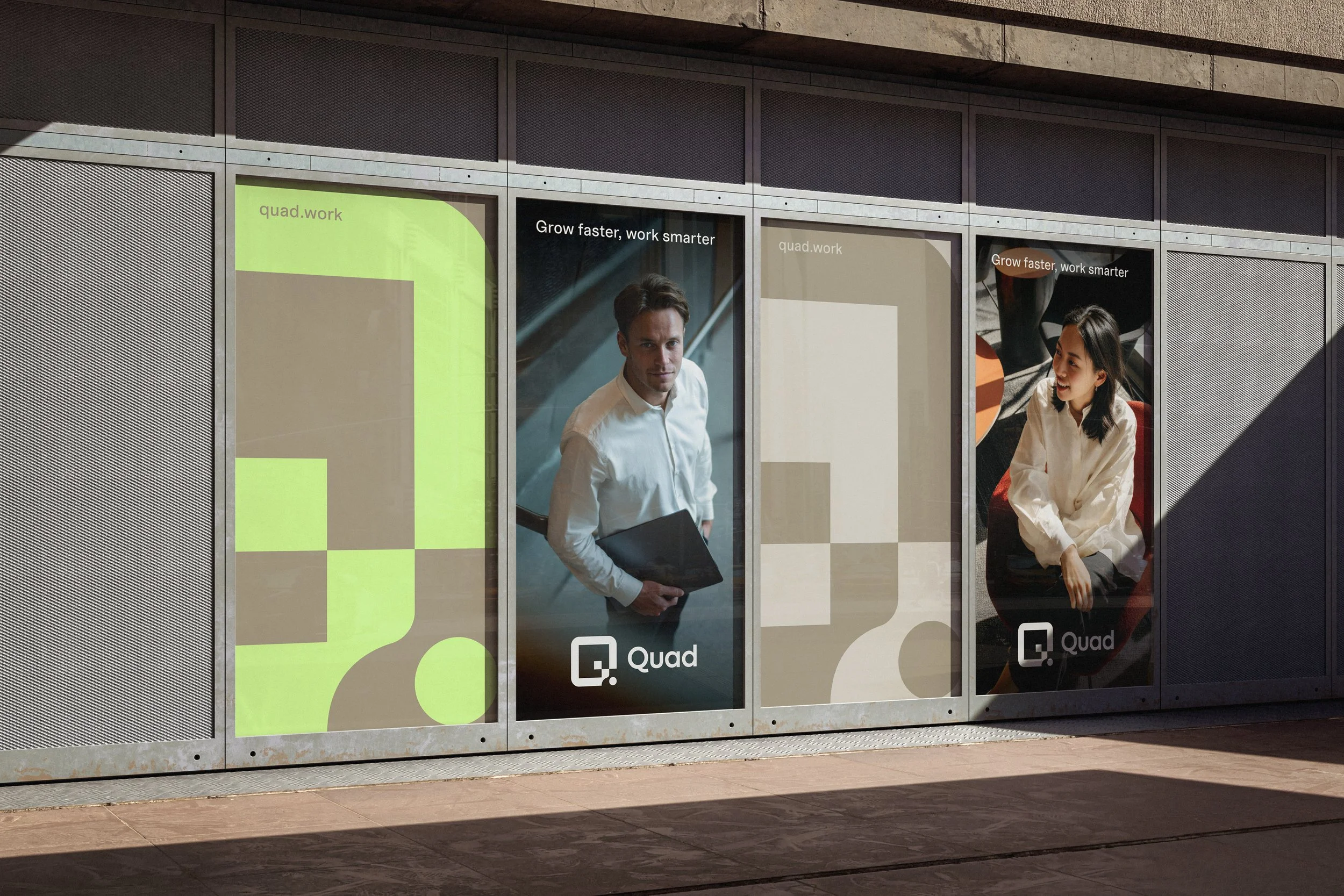
Quad
Grow faster, work smarter
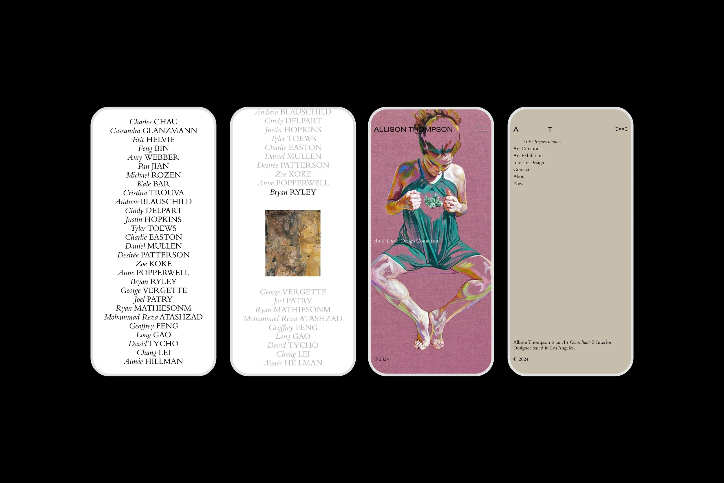
Allison Thompson
Connecting art, people and beautiful spaces

© SUPAMONO