
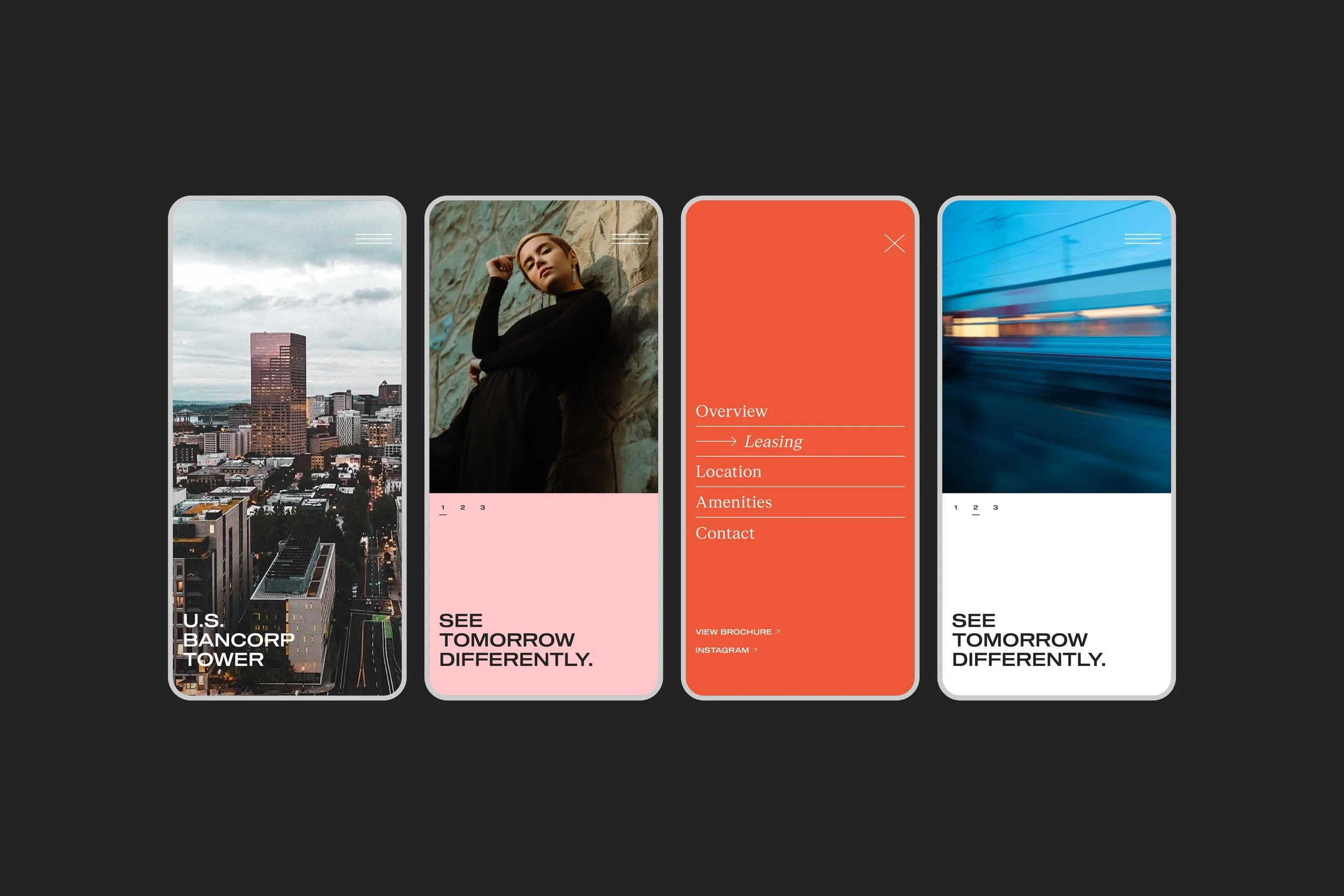
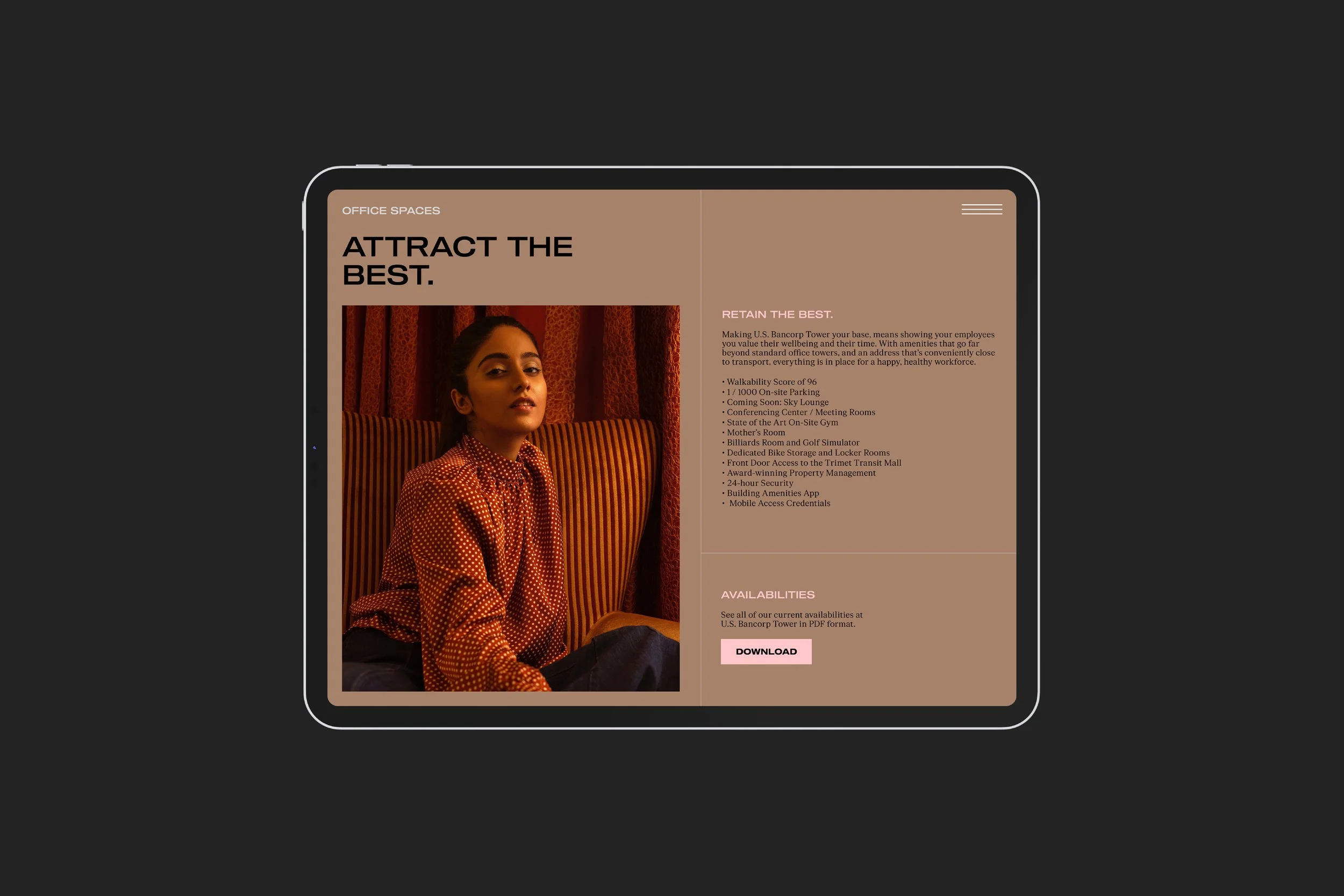
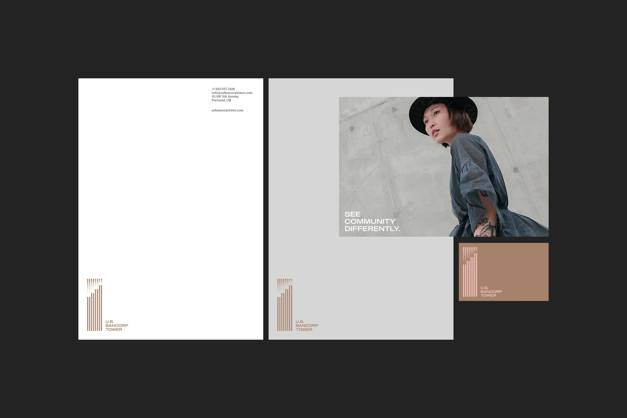
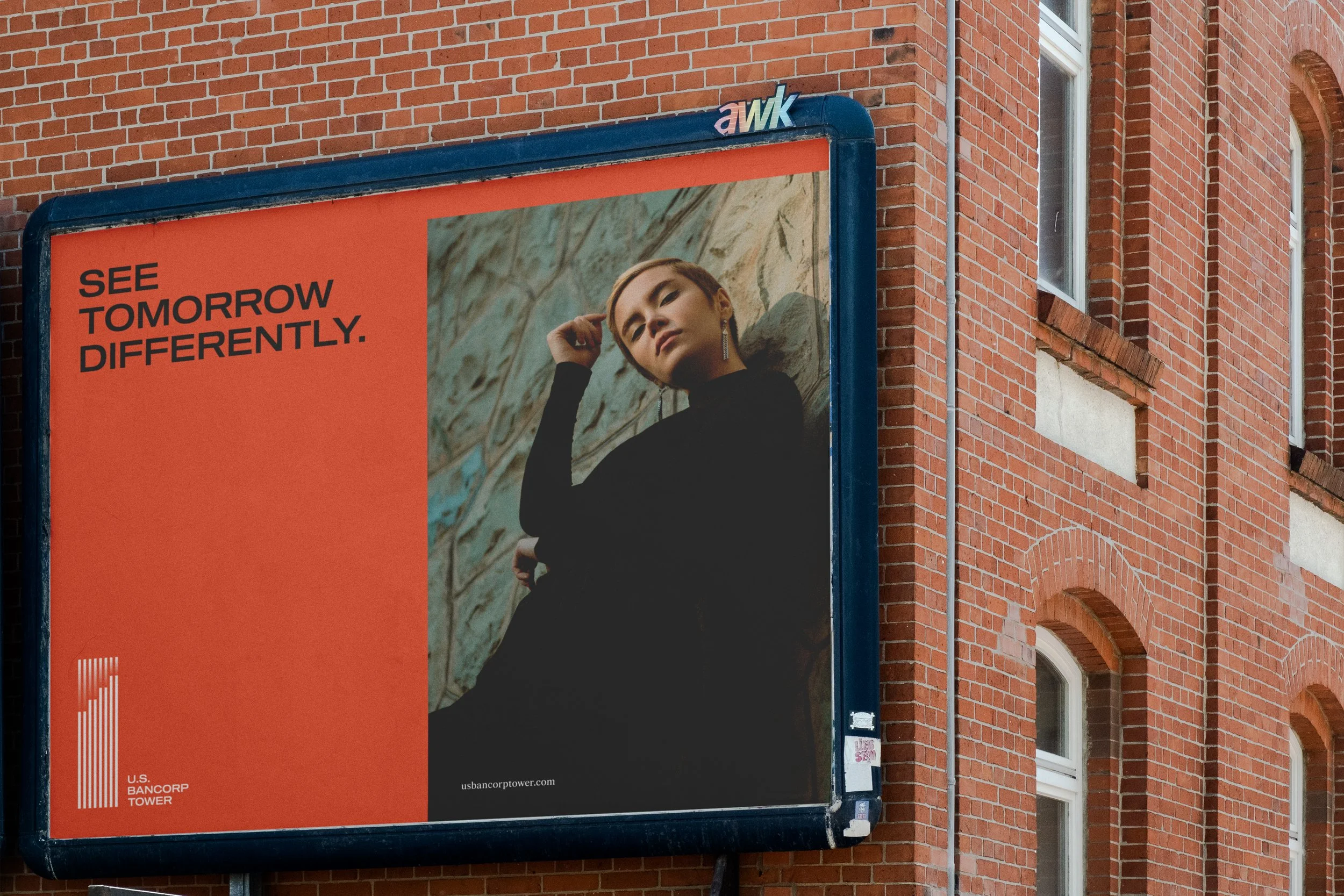
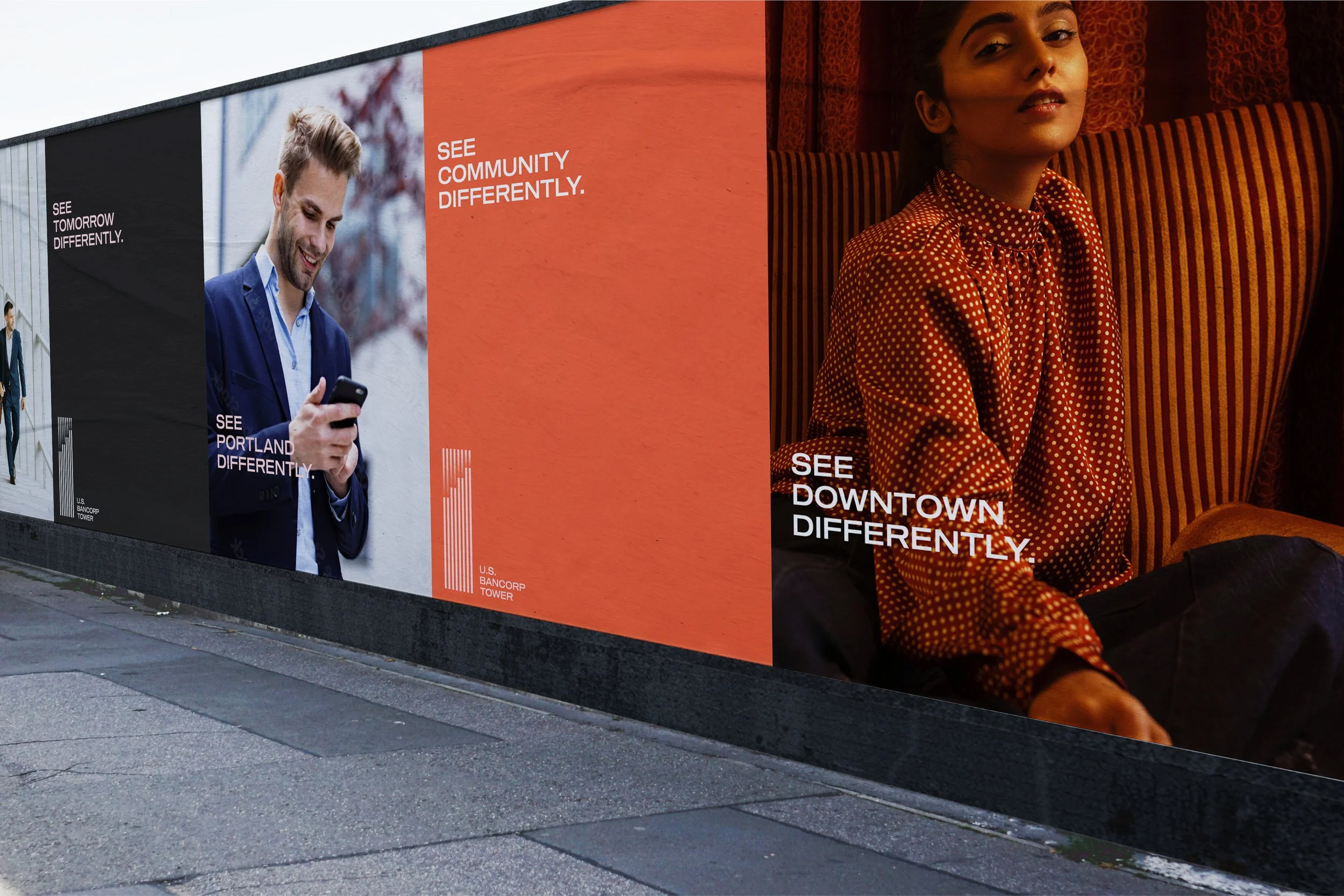
U.S. Bancorp Tower is Portland’s most recognizable address. Affectionately known as “Big Pink,” it stands as a hub for forward-thinking commerce, culture, and community. With a renewed interior, new retail offerings, a refurbished sky lounge, and world-class amenities, the tower redefines the modern downtown workplace and destination.
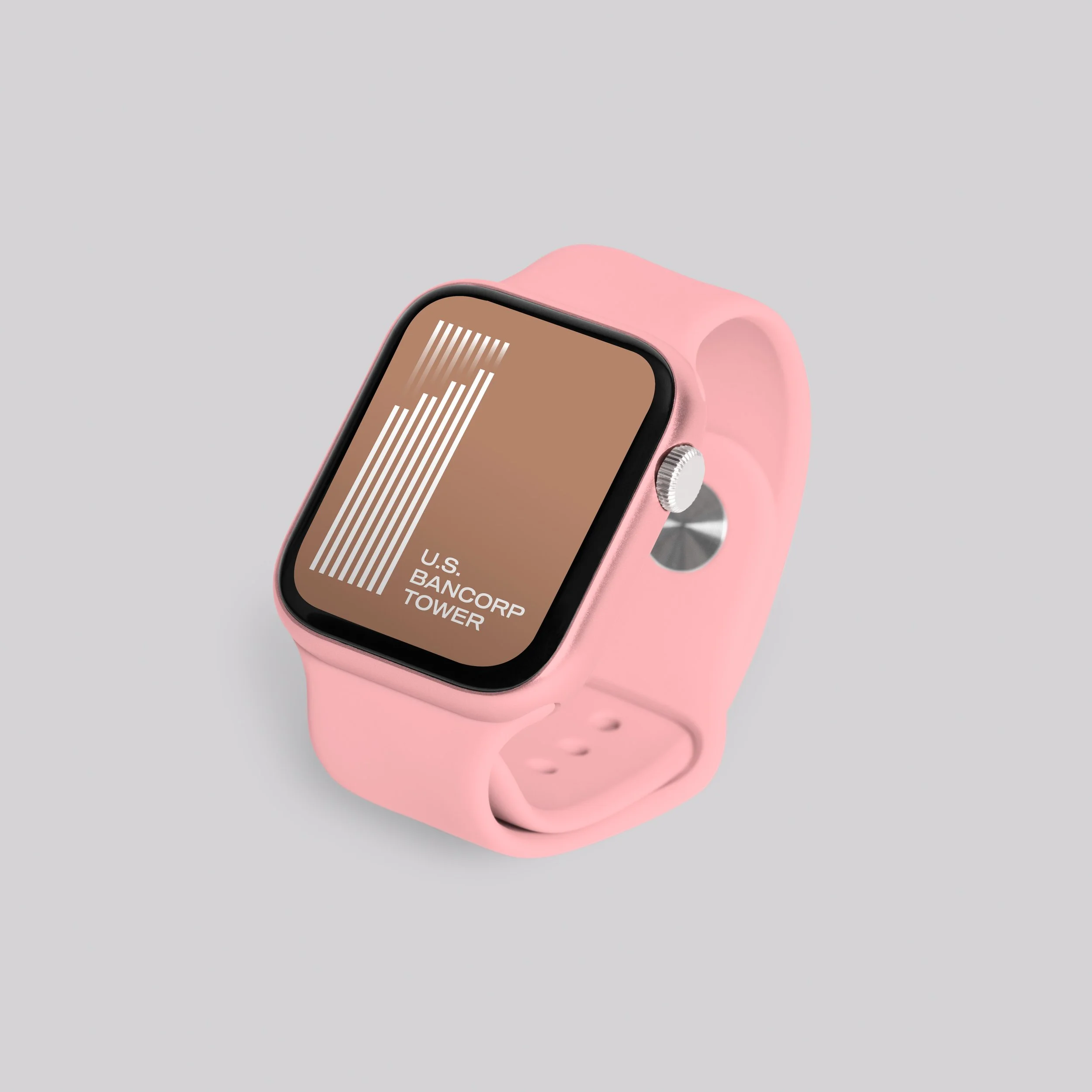
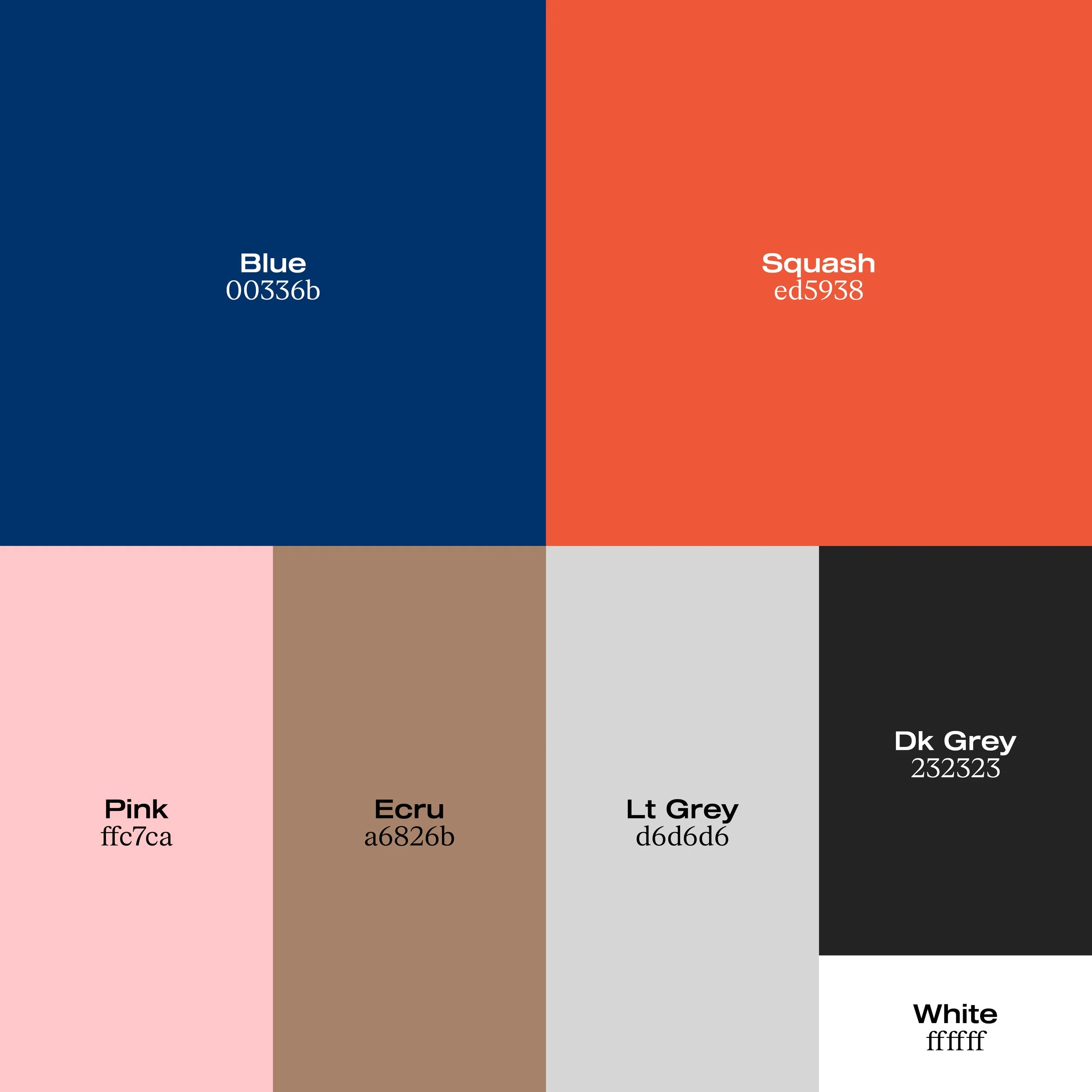
The logo abstracts the tower’s silhouette into ascending lines, echoing its clarity and strength. A subtle gradient evokes the shifting reflections that move across its glass façade. The typographic system is a balance of precision and sophistication. From the confidence of a sophisticated blue to the energy of a vivid orange, and from the building’s iconic pink to a cast of supporting neutrals, this palette captures the optimism of a city in motion.


Collaborators
Studio — Kilograph
Brand Positioning — Letterform
Words — Letterform
Client
Unico
Industry
Real Estate
Location
Portland, OR USA
Services
Strategy, Identity, Digital, Print
Year
2023

© SUPAMONO