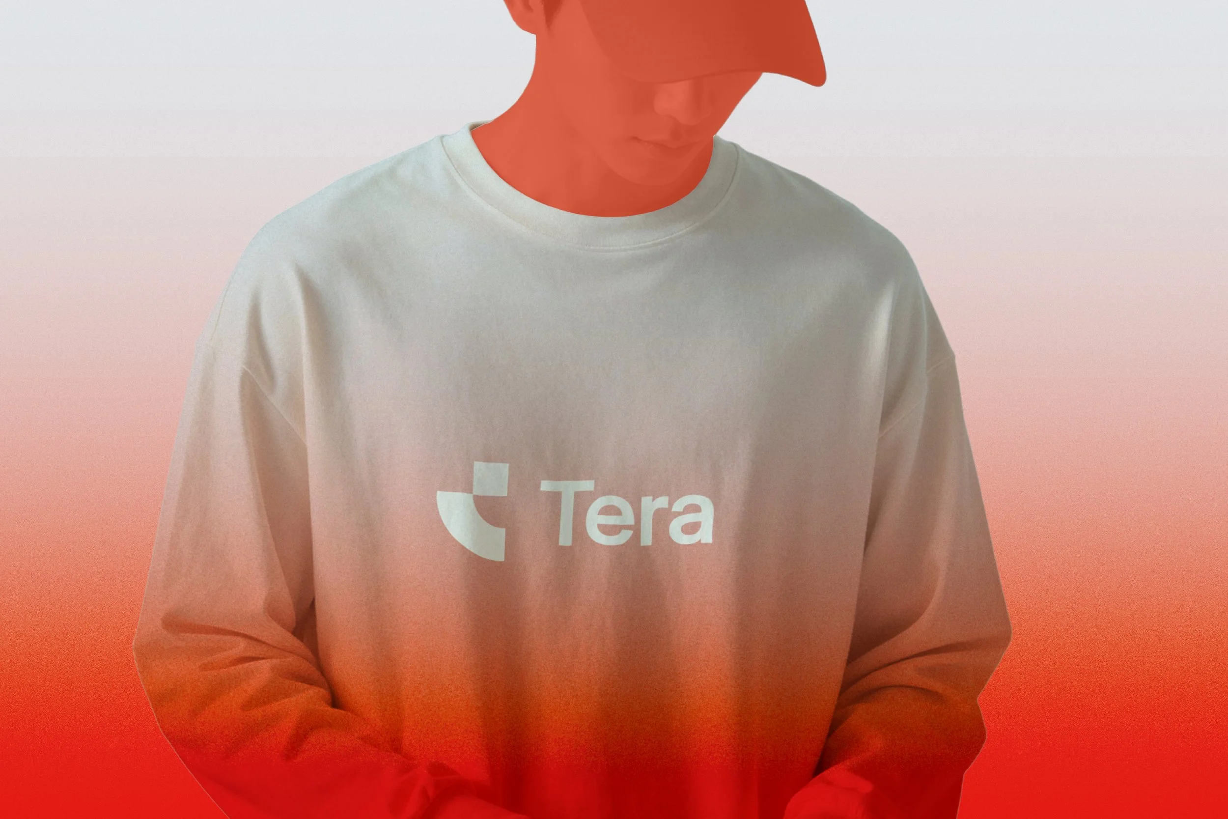
Derived from “terabyte,” Tera represents scale, speed, and digital capacity. It reimagines workspace for the cloud era, combining physical infrastructure with on-demand flexibility to help modern businesses scale, adapt, and deploy teams with ease. Tera is designed to transform how companies access and use workspace.

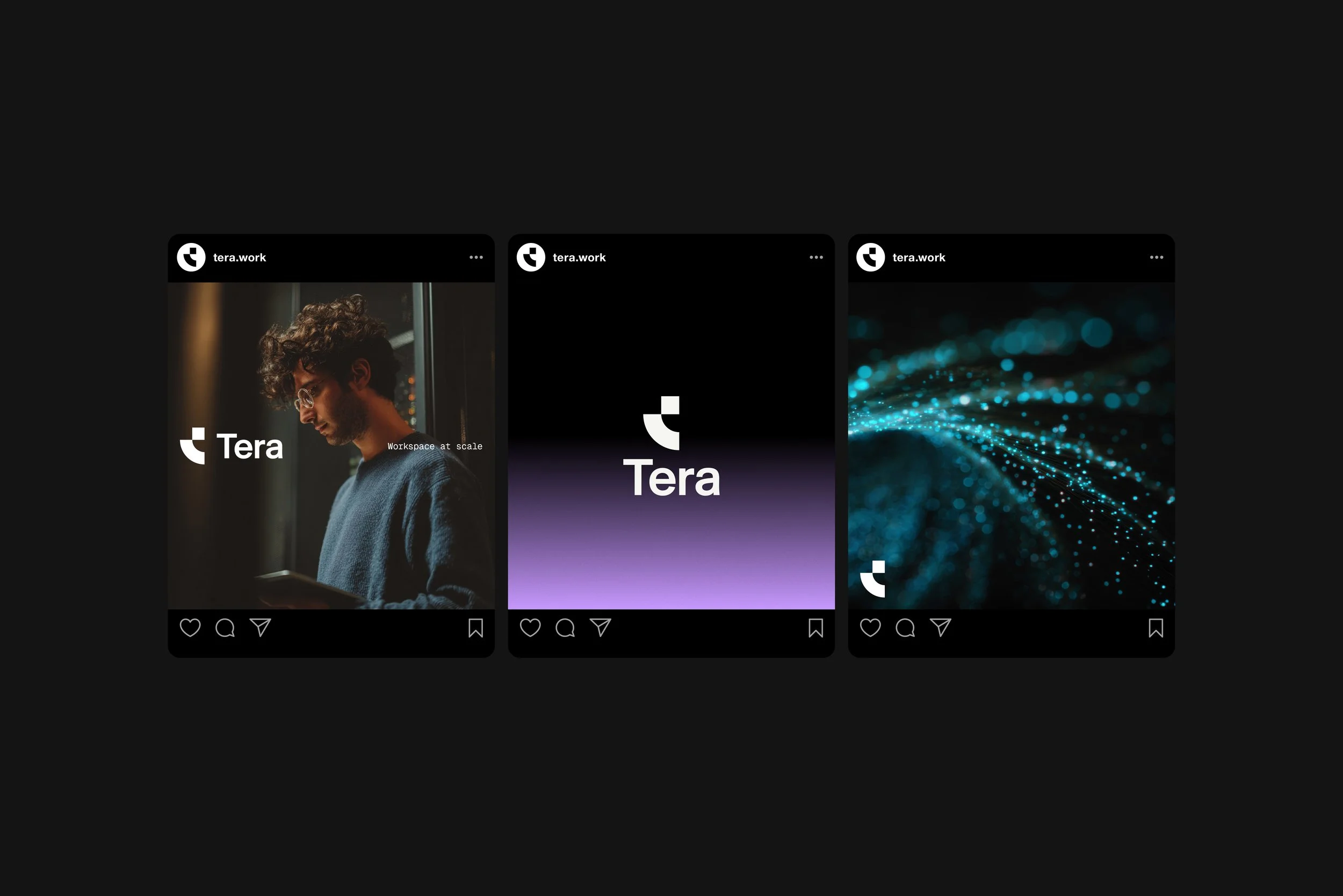
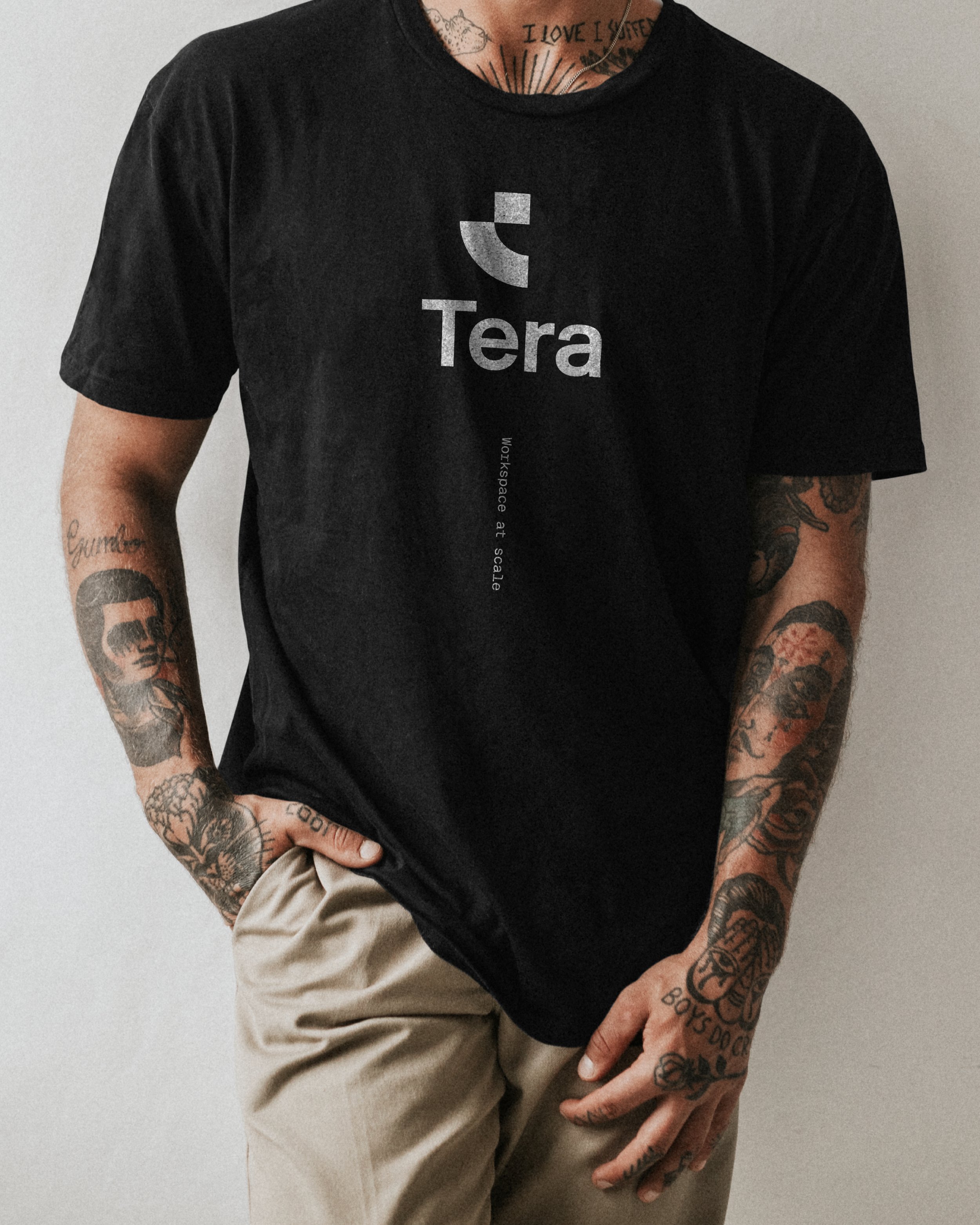
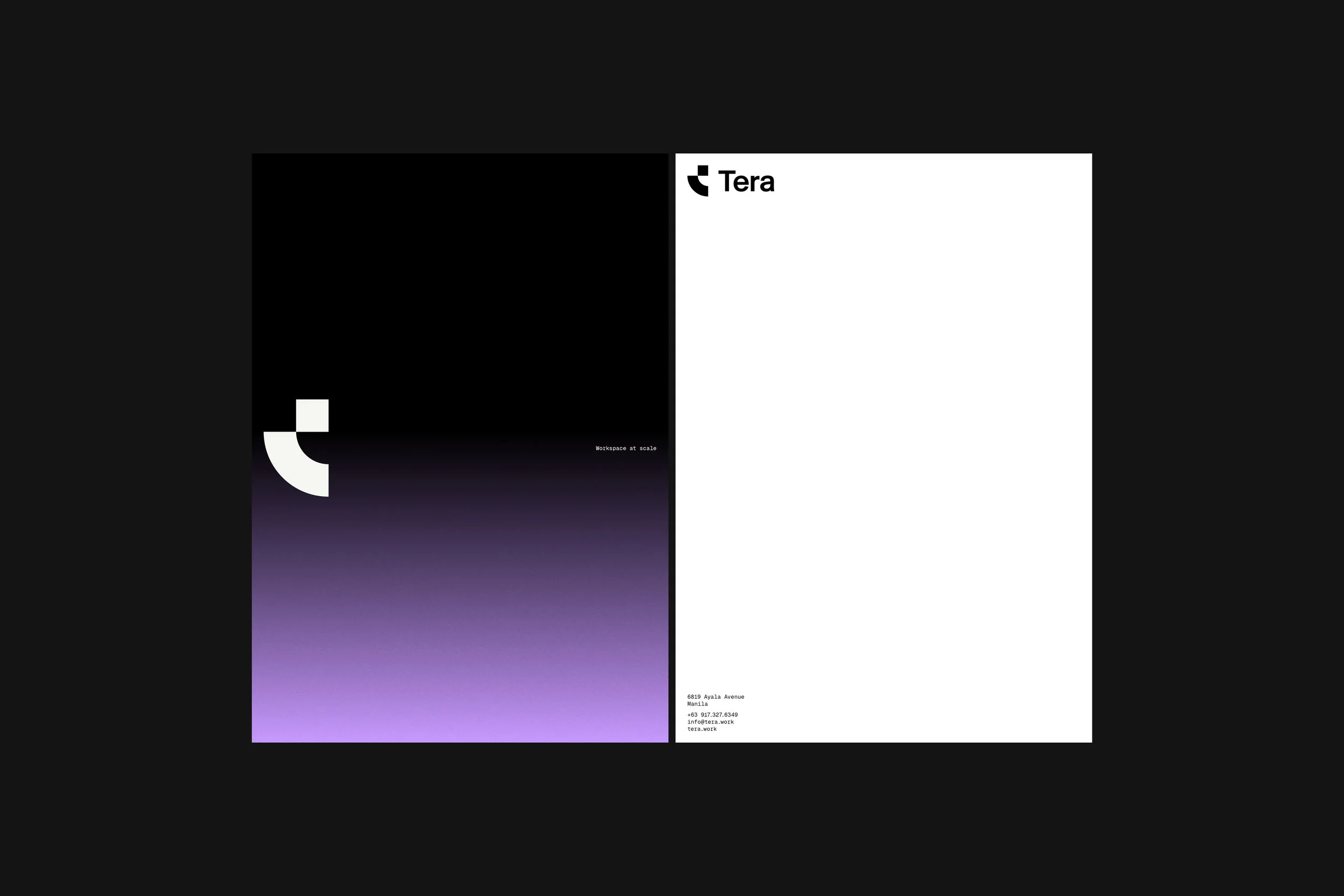
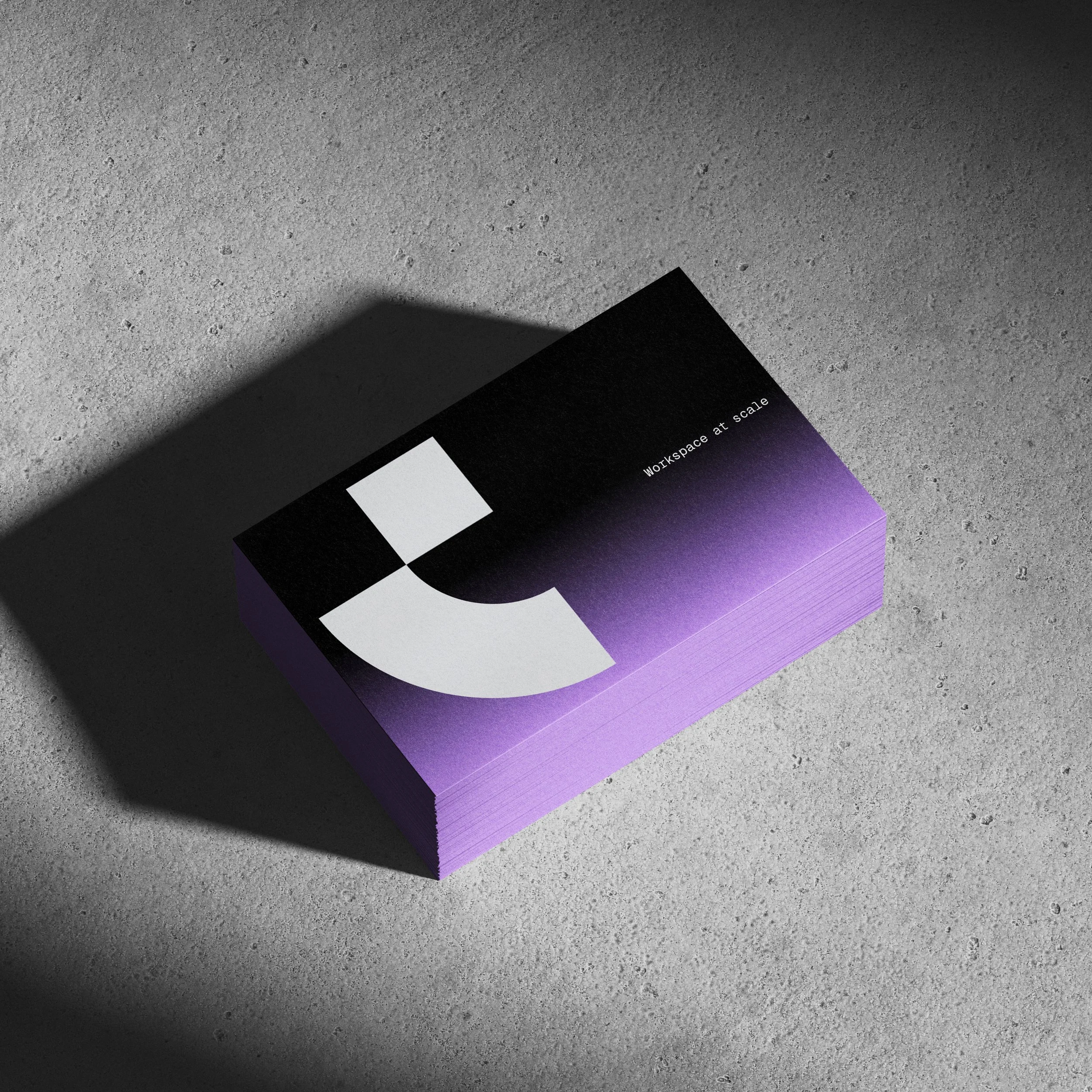
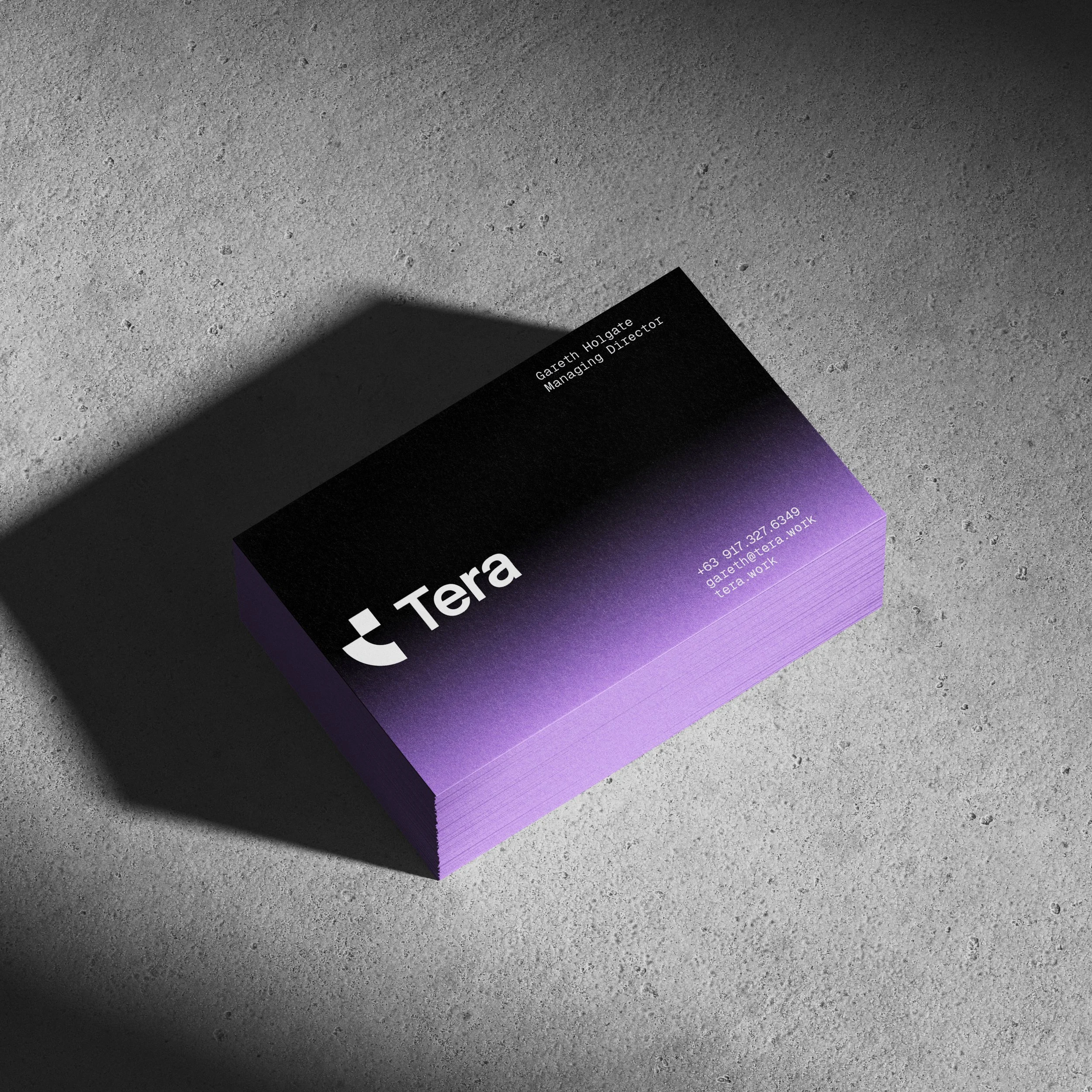
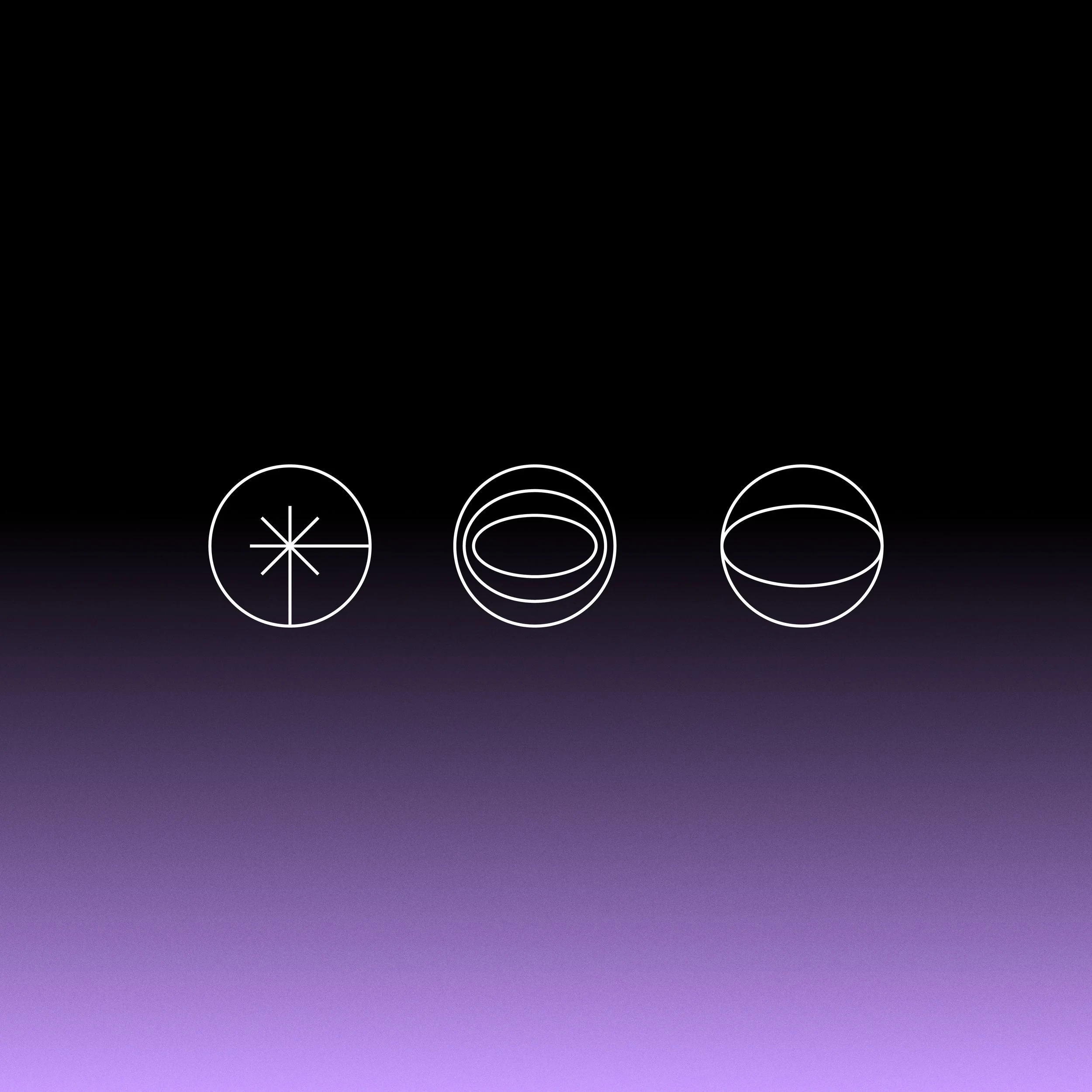
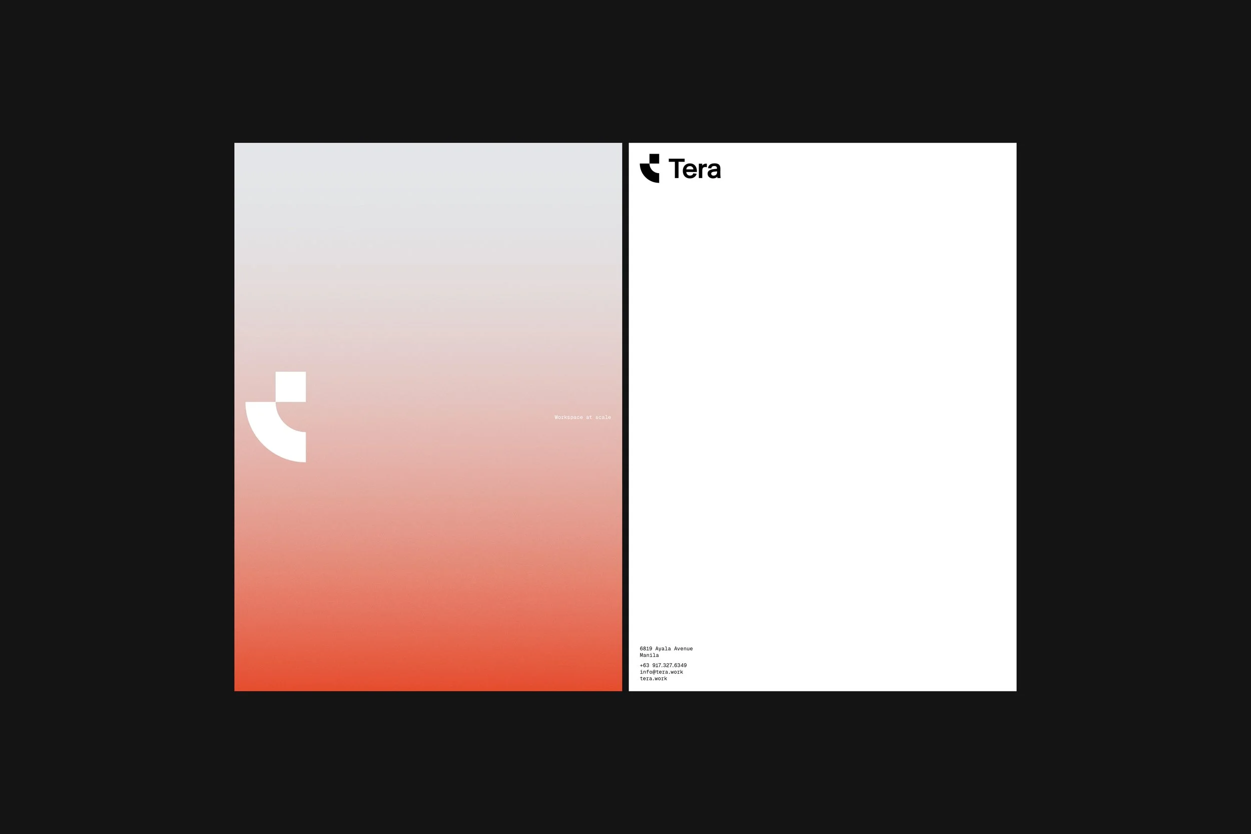
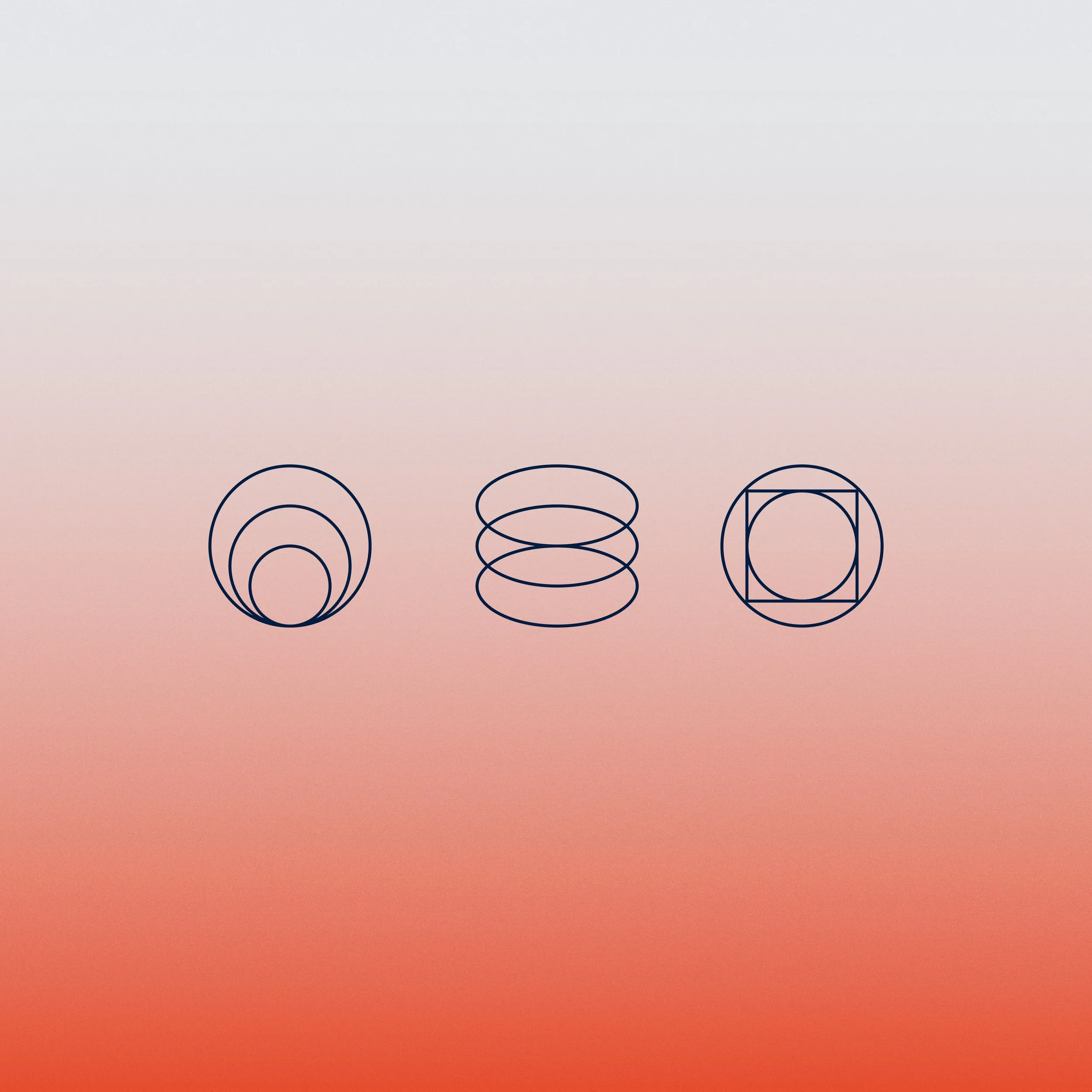
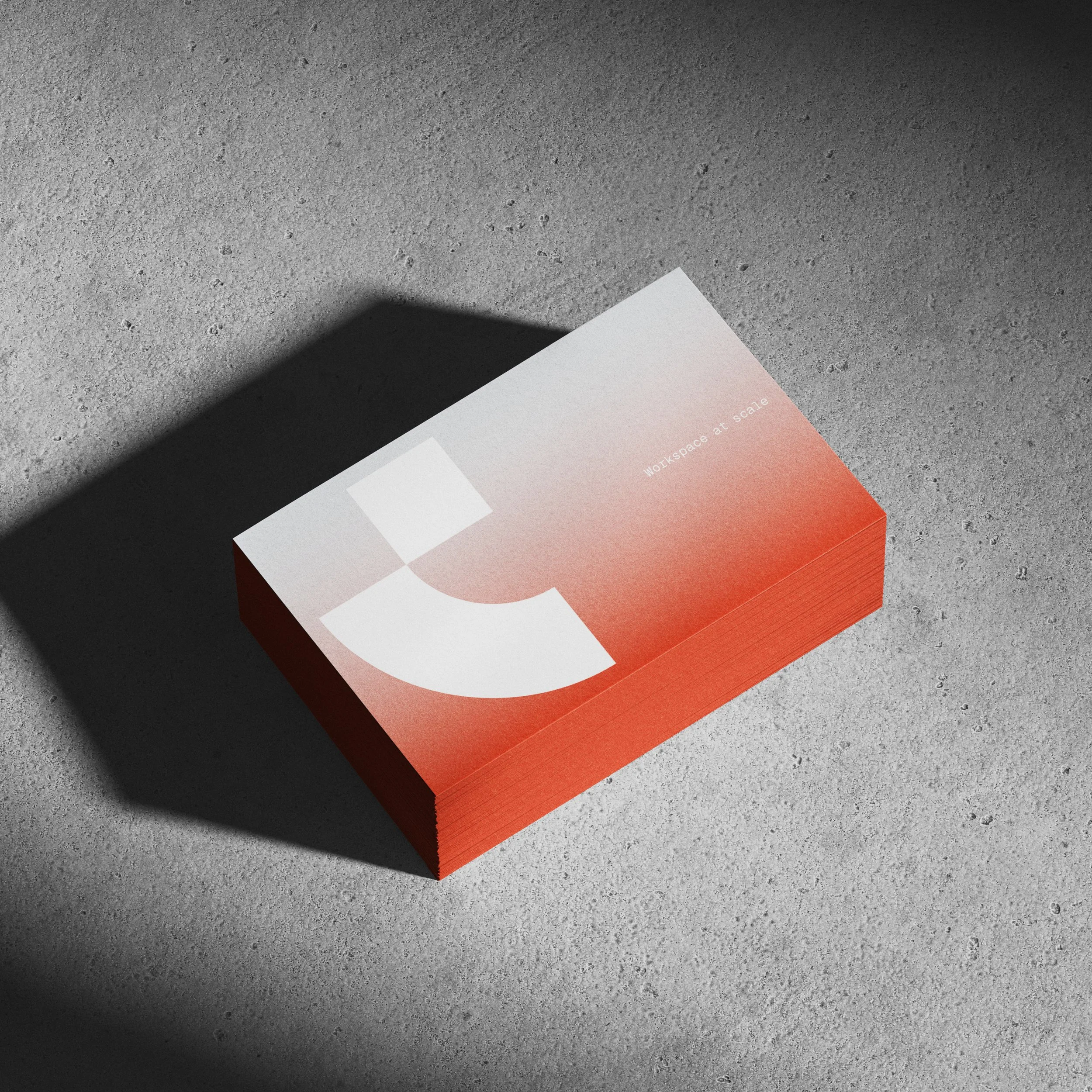
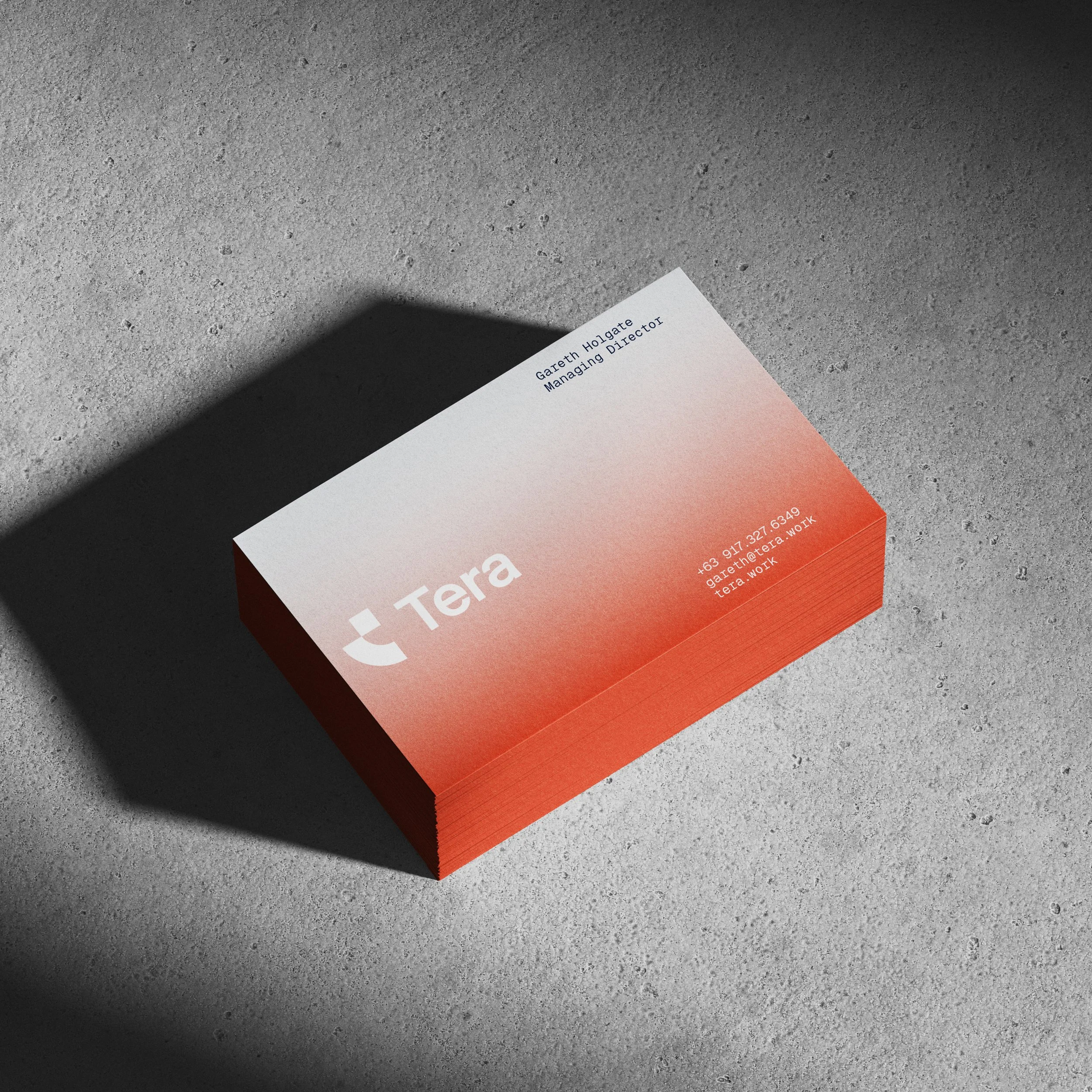

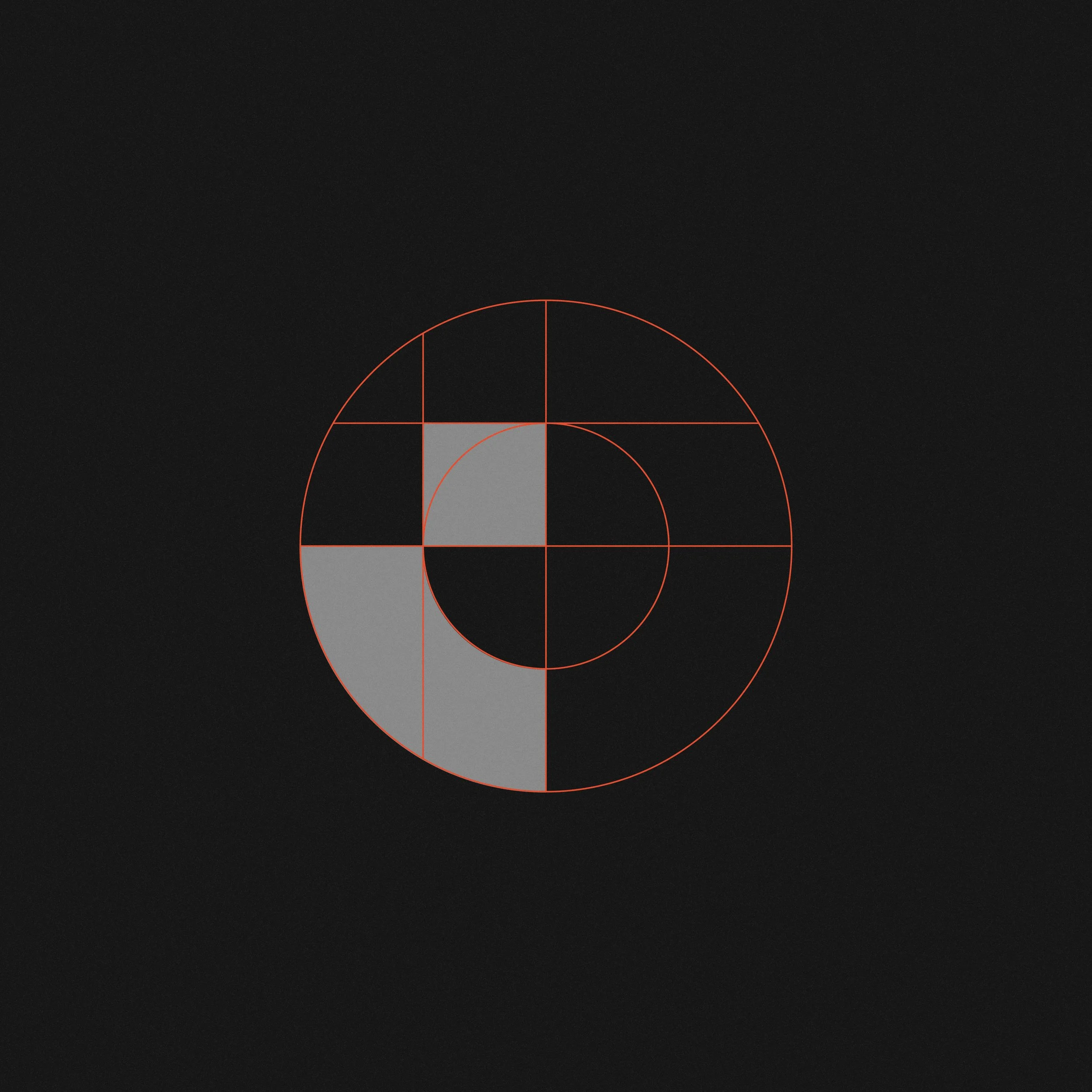

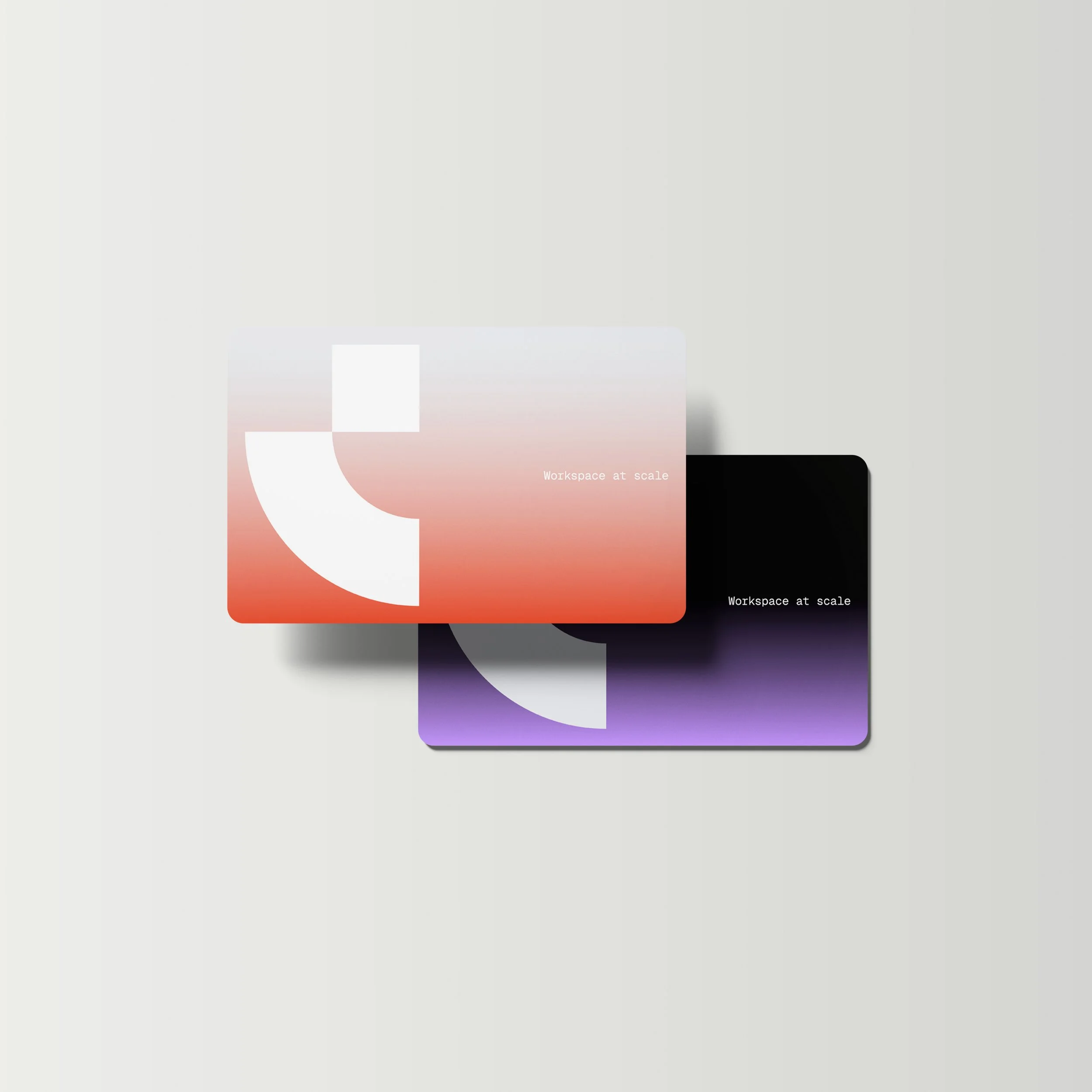

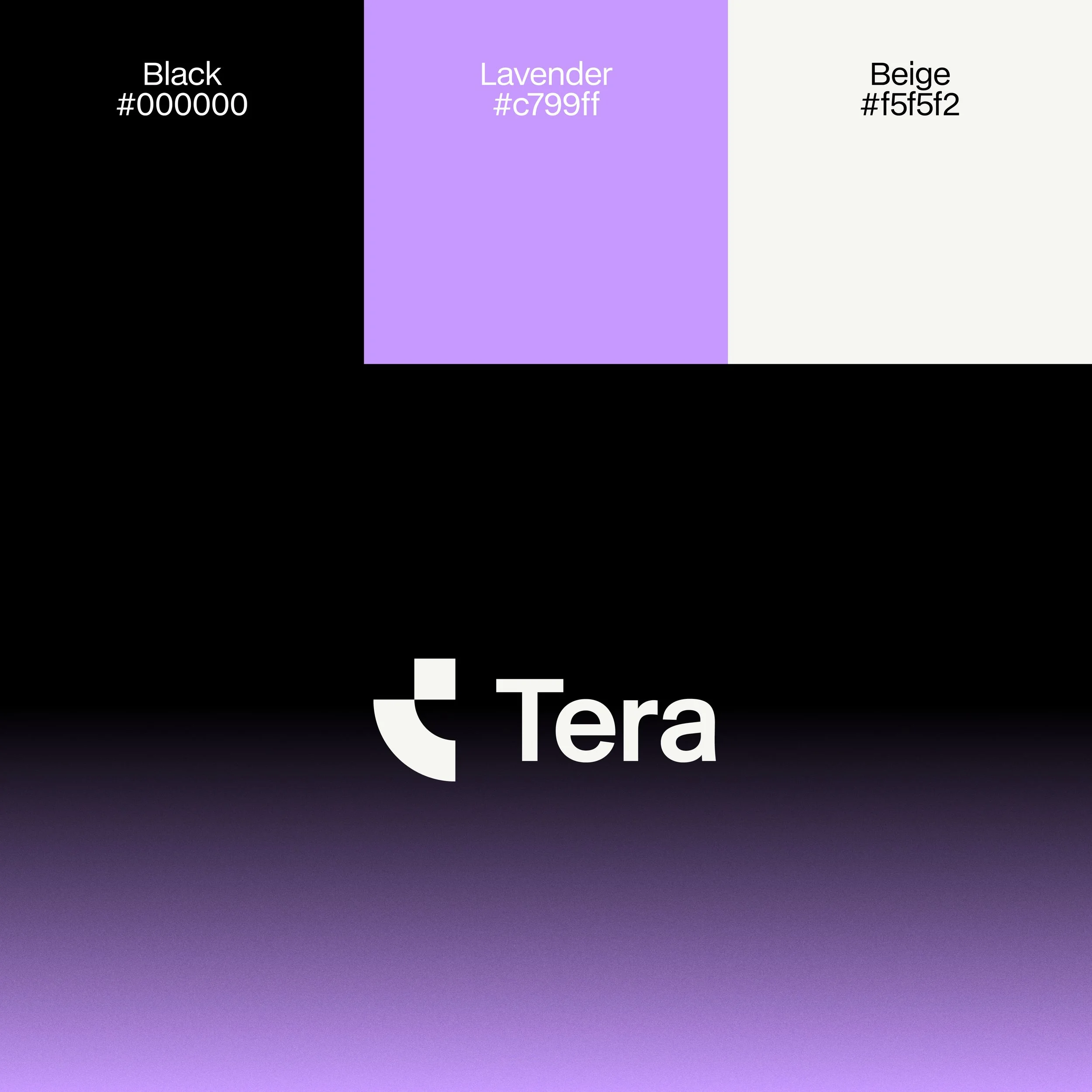
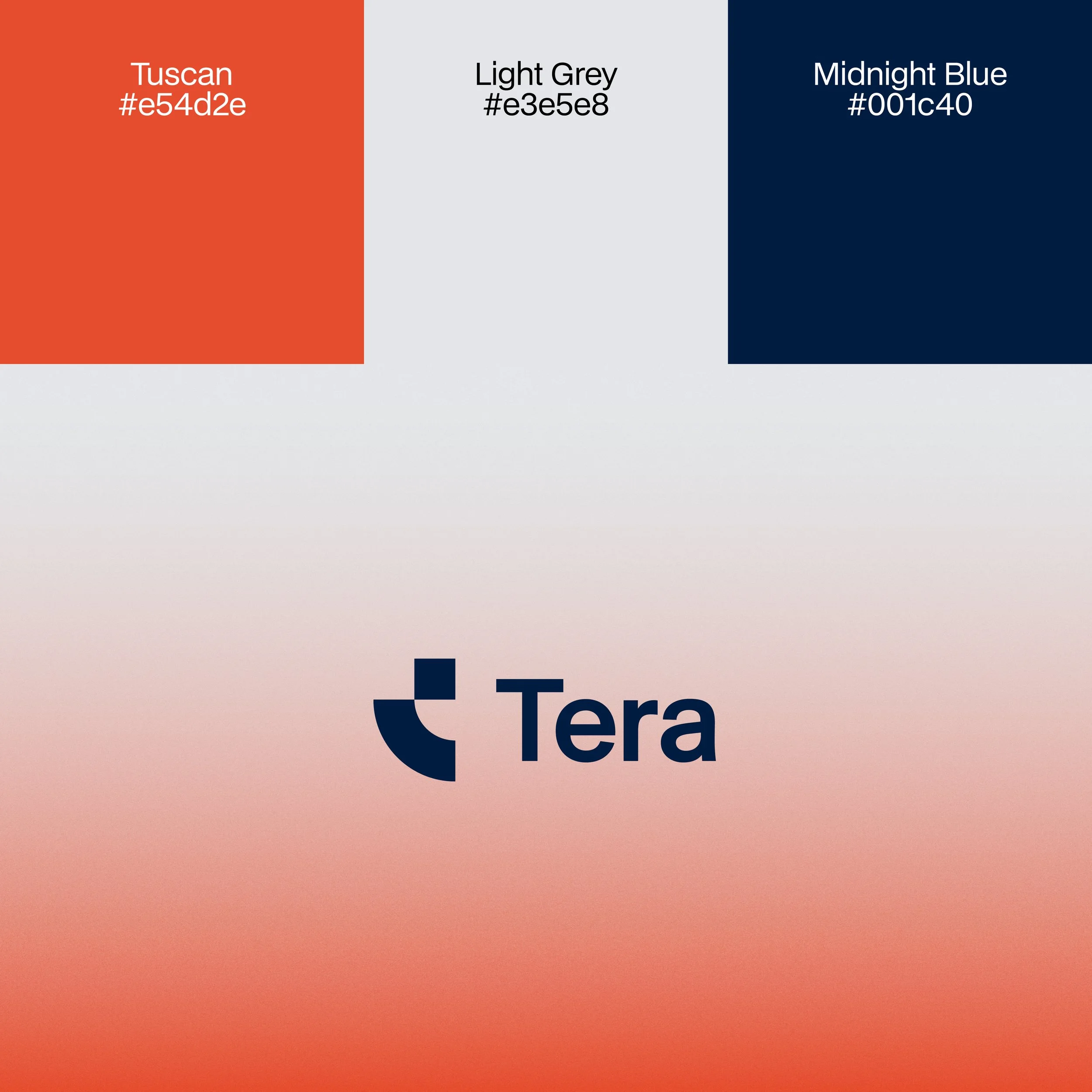
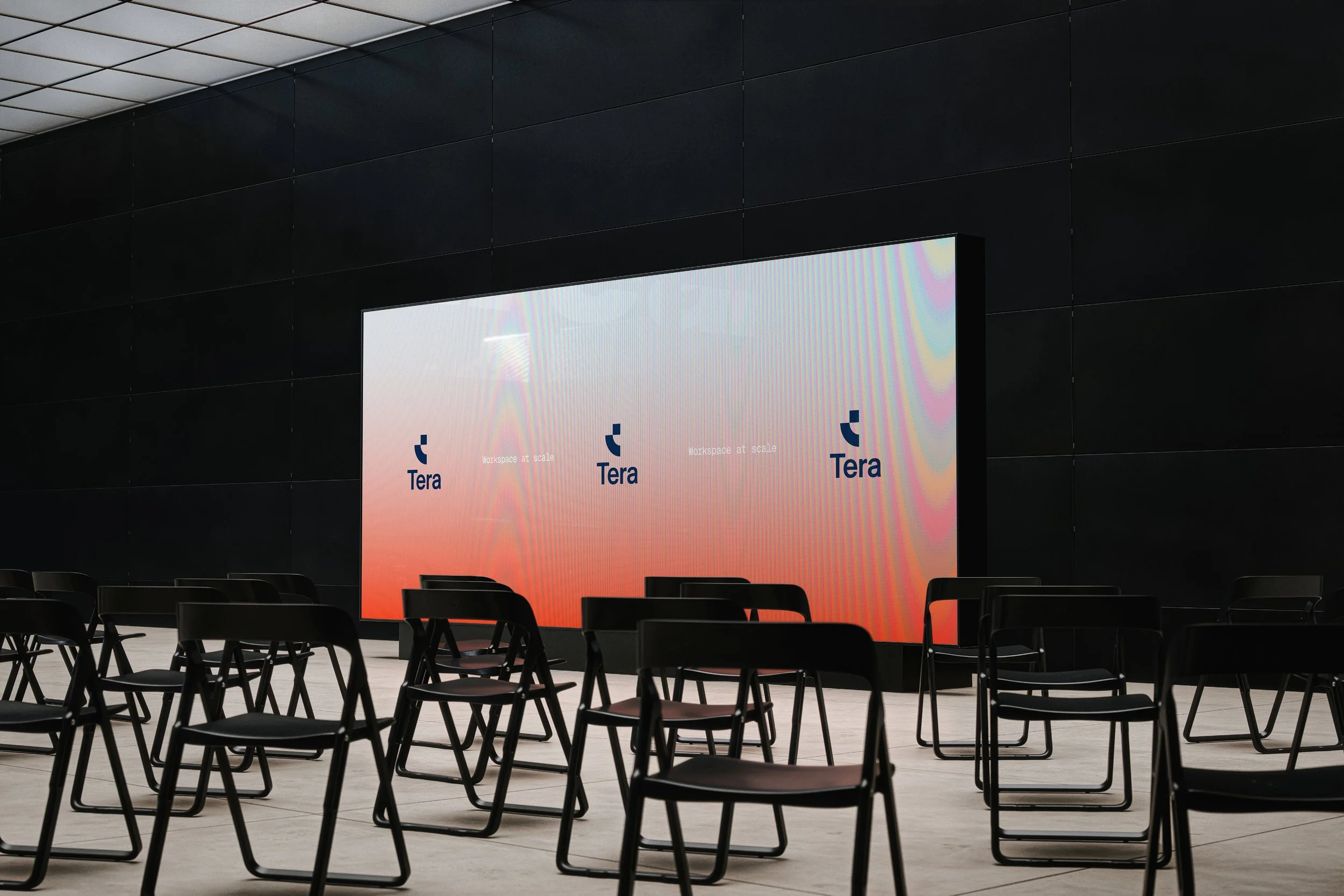
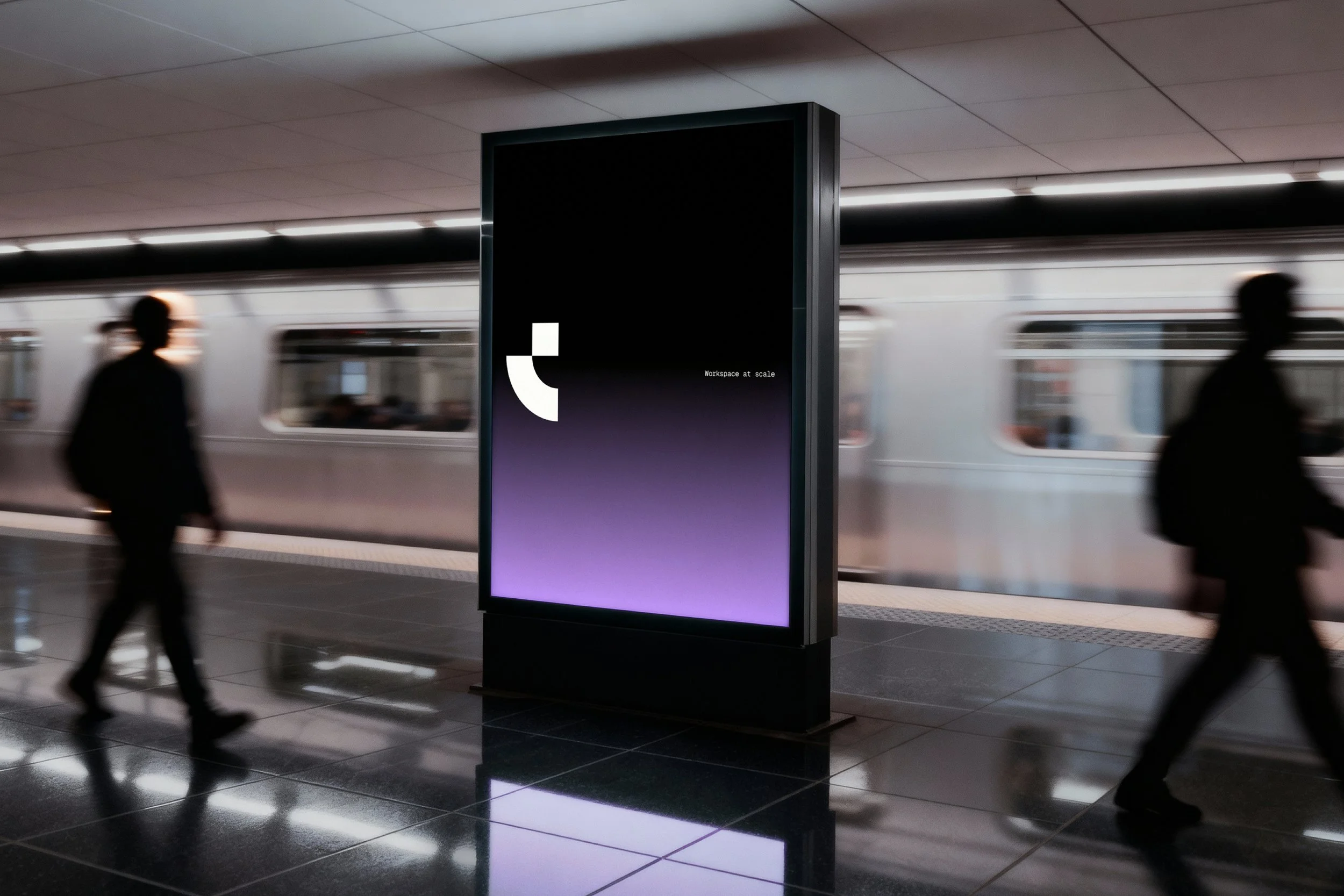
Inspired by the binary language of computing, the identity transforms the 1 and 0 into a distinctive geometric symbol. The wordmark extends this balance of structure and simplicity, while a day-to-night color palette reflects continuous operation. A system of single-weight line icons reduces complex actions to clear, intuitive signals. The typography balances technical precision with human expression. BDO Grotesk provides structure and clarity, Lust Text adds warmth and character, and Geist Mono references the language of code. Each element is designed to express the same principle: intelligent systems made simple.
Client
AXON Group
Industry
Real Estate, Technology
Location
Manila, Philippines
Services
Strategy, Identity, Digital, Print
Year
2026
You may also like
ap–c.co
Easy as ap–c

Brett Jones Photography
Move with intent

© SUPAMONO