
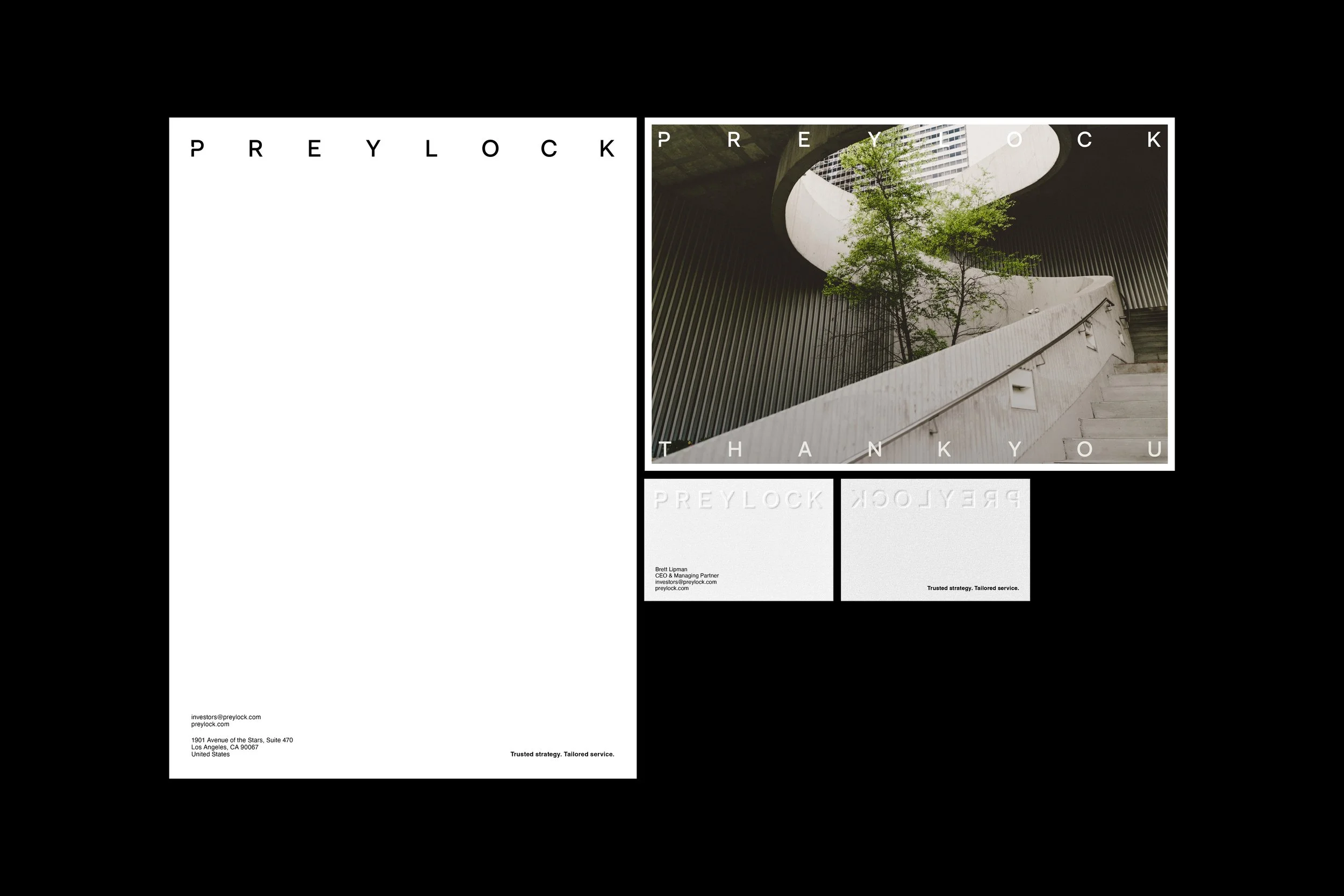
Preylock is an established asset manager trusted by investors to meet their needs, goals and risk profiles with superior security and service. Through proven procedures, rigorous compliance and a culture of proactive strategy, they build long-term value for their partners, tailored to the individual and focused on the exceptional.
This innovative approach informed the new identity—anchored in simplicity and defined by restraint. The monogram, crafted with subtle radii, conveys openness and strength. The wordmark moves with precision and calm rhythm, driven by a sense of progress and intent. Supporting the brand foundation is an isometric grid that introduces a subtle spatial texture. Its interlocking geometry echoes Preylock’s role in shaping structured security environments. A grounded primary palette communicates strength and sophistication, while supporting colors bring stability and focus. The typographic system balances precision with poise: PP Writer offers a refined, contemporary sensibility for headlines, while Helvetica provides the counterpoint—grounded, legible, and timeless. This is simplicity with dimension.


Collaborators
Studio — Kilograph
Brand Positioning — Letterform
Words — Letterform
Client
Preylock
Industry
Finance, Real Estate
Location
Los Angeles, CA USA
Services
Strategy, Identity, Motion, Digital, Print
Year
2023

© SUPAMONO