
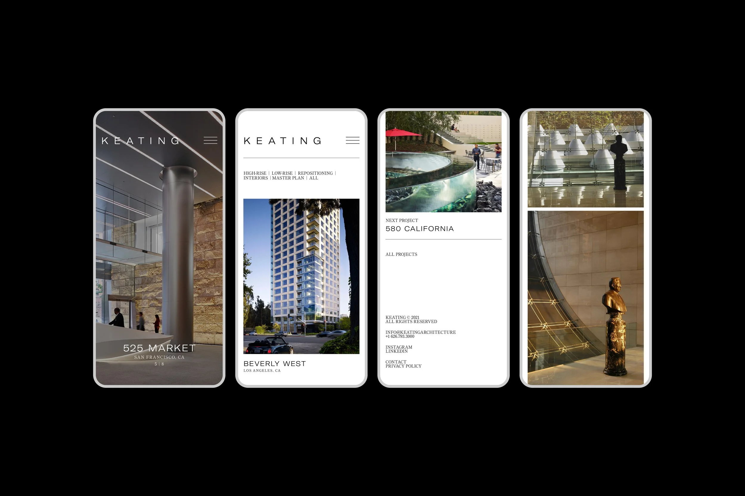
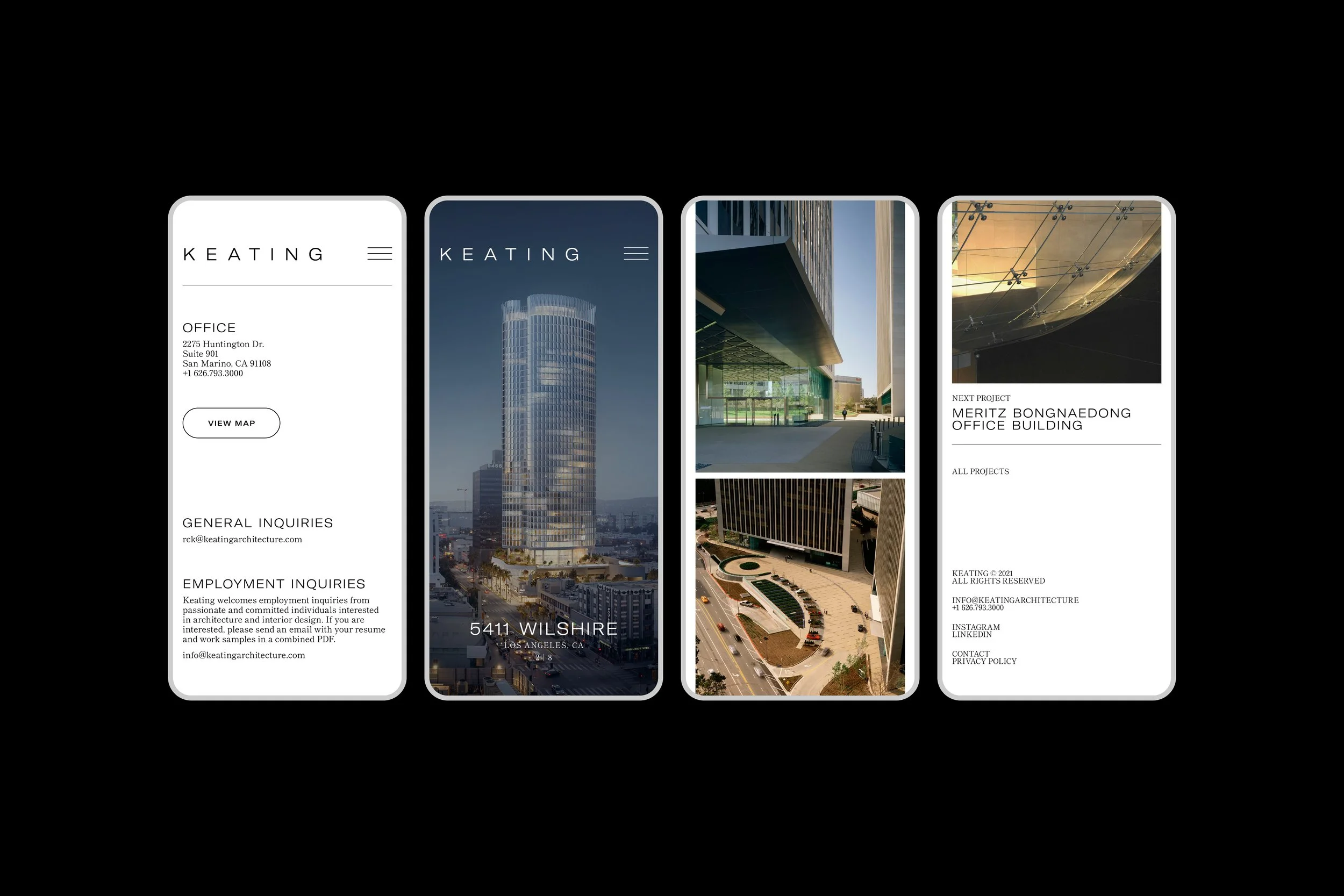
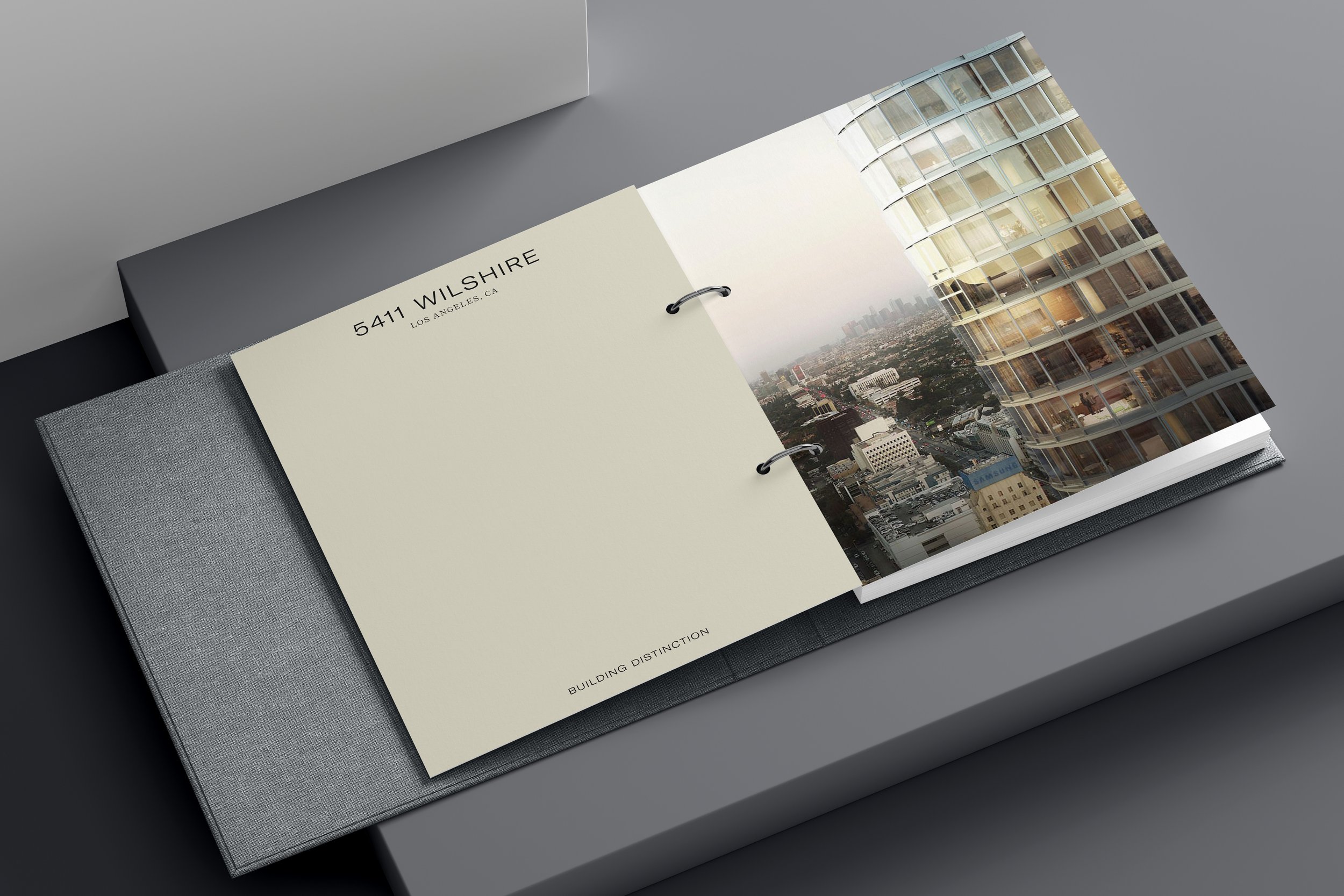
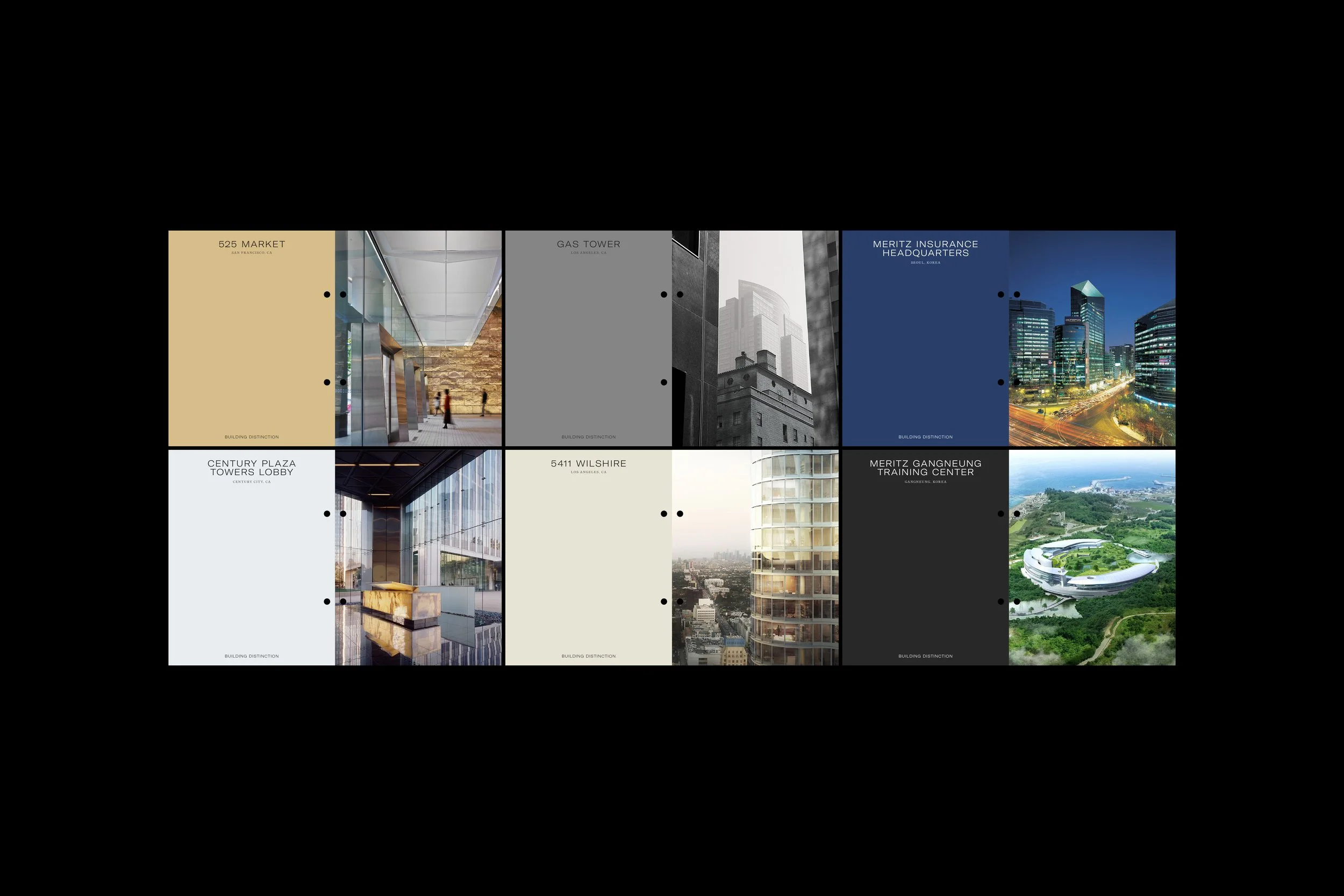
Keating Architecture crafts signature landmarks in city centres across the globe from their Los Angeles studio. They are recognised for their commitment to design quality and attention to detail. This resulted in an understated identity, allowing their depth of expertise in creating sophisticated forms to take centre stage.
We developed a wordmark with generous spacing that allows each letter to breathe. It’s a logo that doesn’t demand attention but earns it through poise. The type pairing offers a contemporary voice infused with a quiet sense of tradition and a monochromatic spectrum establishes a confident foundation for the brand.


Collaborators
Studio — WTW
Platform — Squarespace
Client
Keating Architecture
Industry
Architecture
Location
San Marino, CA USA
Services
Strategy, Identity, Motion, Digital, Print
Year
2021

© SUPAMONO